Wholesome
& Healthy
WHOLE EARTH FARMS | IDENTITY + PACKAGING REFRESH
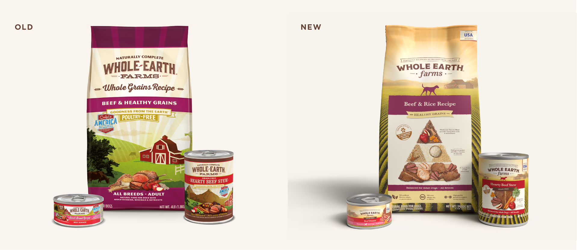
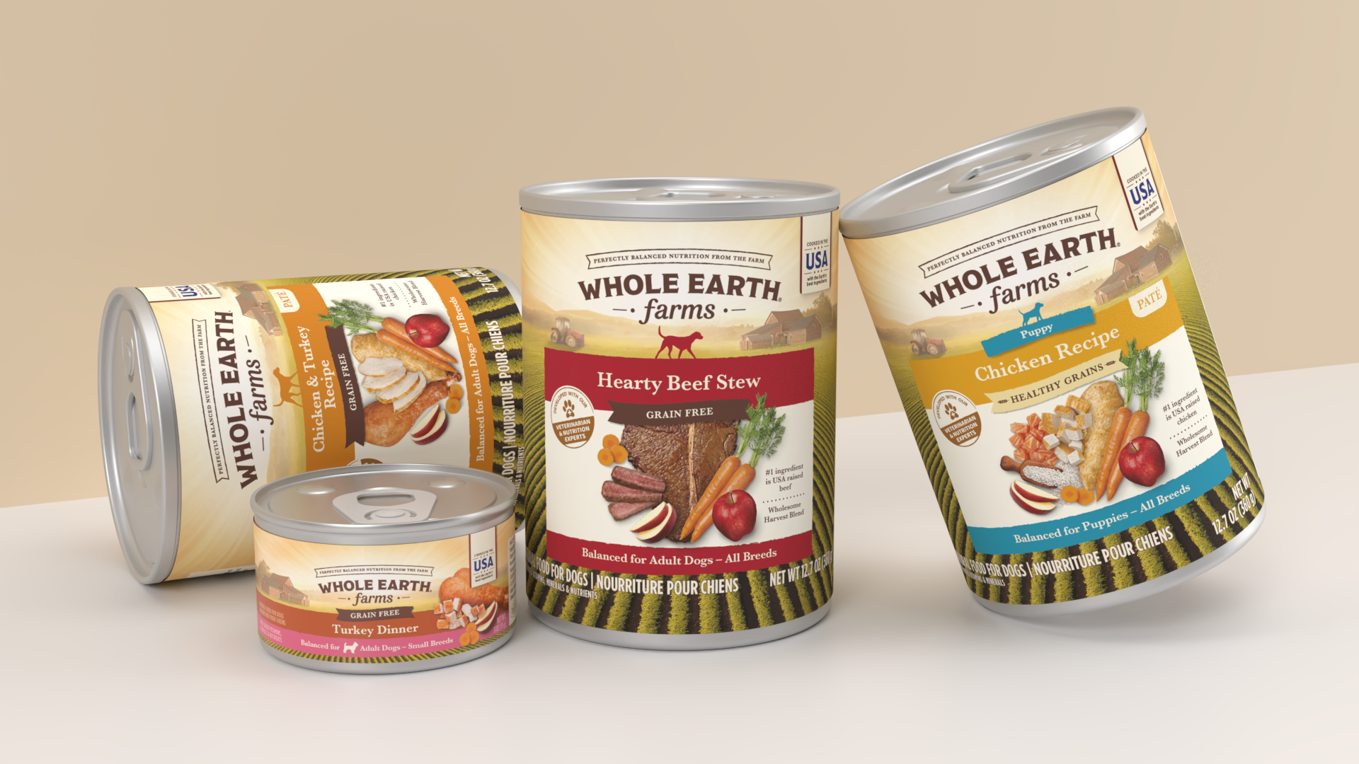
Whole Earth Farms underwent a comprehensive brand and packaging redesign aimed at modernizing the identity while honoring the heart of the brand’s farm-to-bowl story. The refresh spanned the entire product lineup — dry dog food bags and wet cans — evolving the visual system into a more contemporary expression while maintaining the warmth and trust customers already recognized.
KEY CONTRIBUTION:
Brand Identity Refresh · Design Concept · Packaging System Design · Packaging Extension · Imagery Composition · Marketing Launch Material
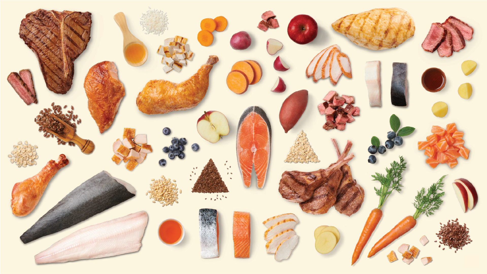
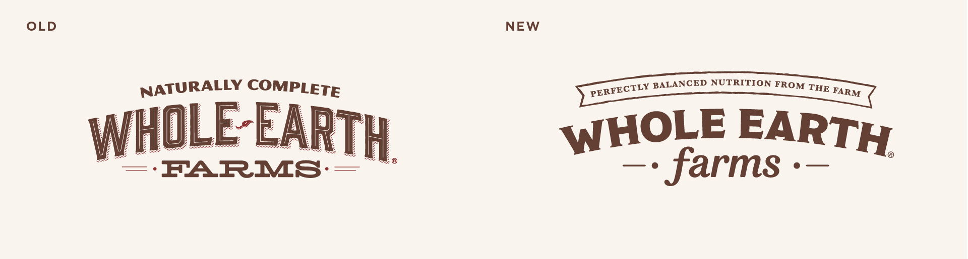
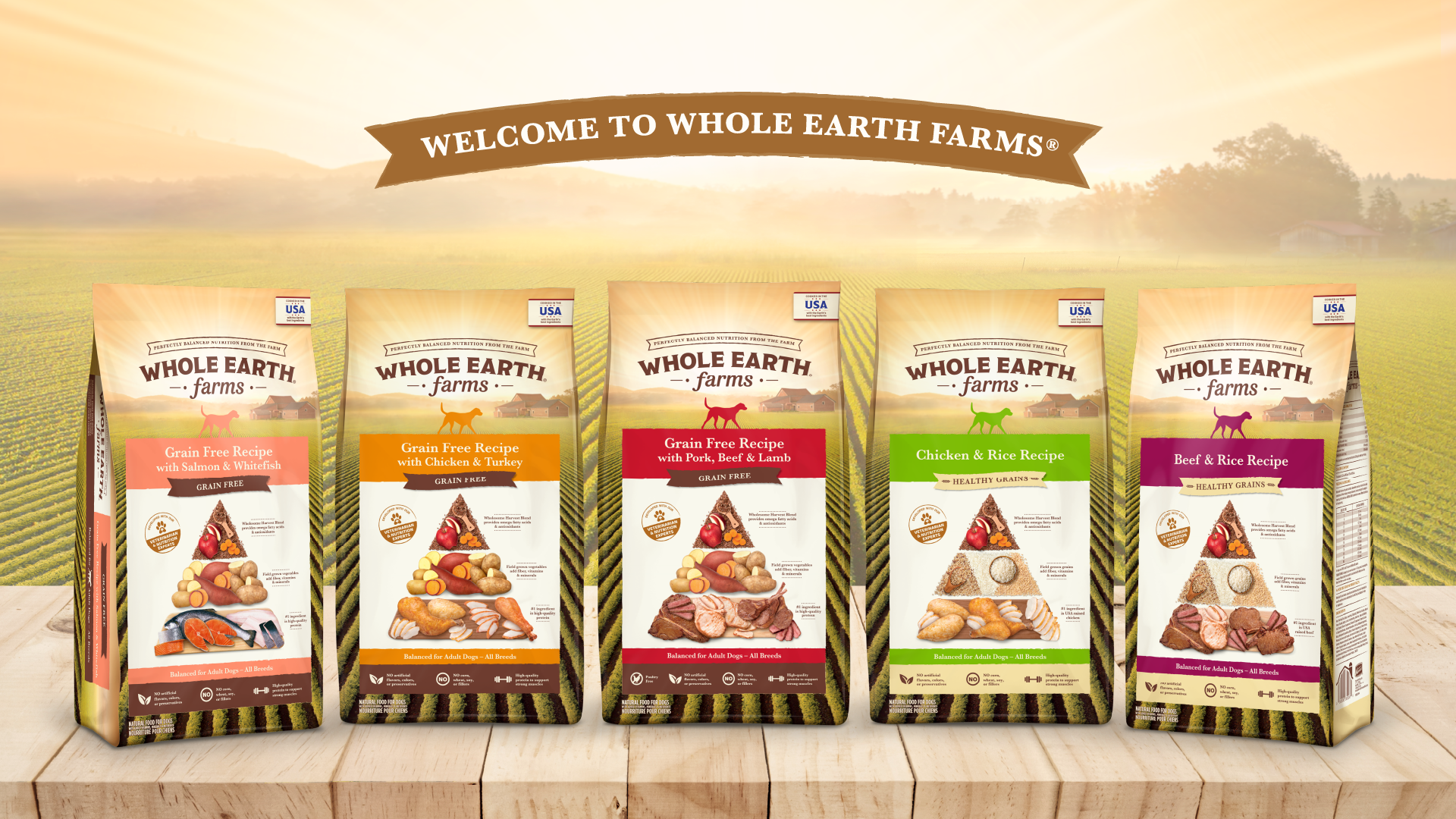
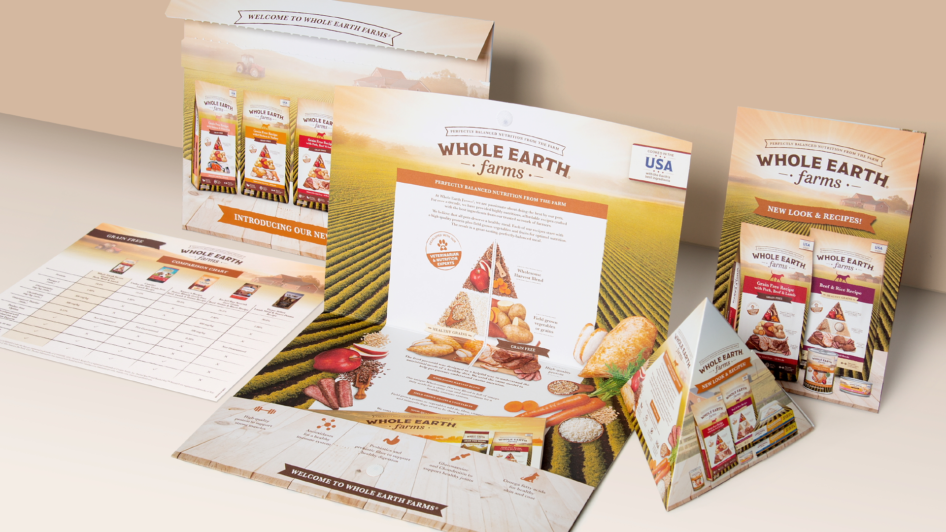
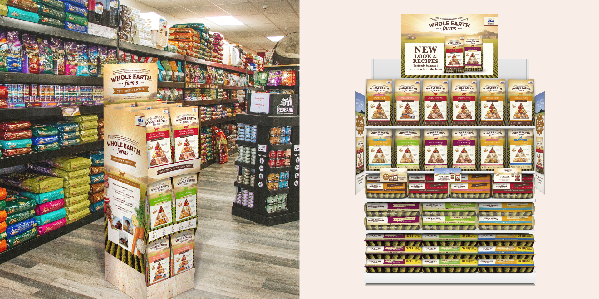
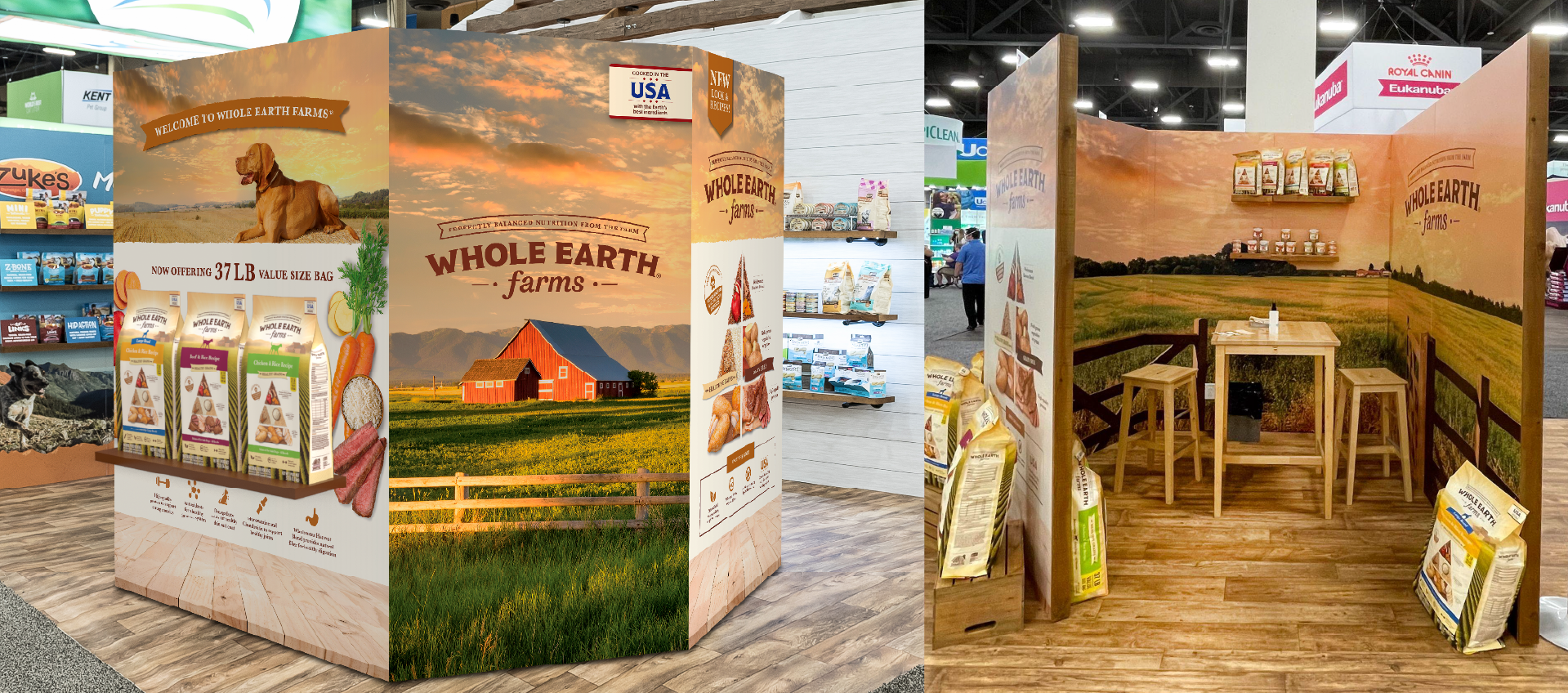
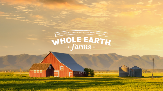
The approach focused on refining and elevating the brand’s most recognizable elements — the farmhouse, expansive fields, and sunburst sky — rather than replacing them. A panoramic landscape now wraps around each bag, creating a continuous scene across the front, side, and back panels. This immersive detail invites consumers to explore the package while reinforcing the farm narrative. The logo was modernized with cleaner typography and improved balance, while preserving the established visual hierarchy to maintain familiarity and shelf presence.
The refreshed identity extended beyond packaging into a cohesive launch system that included training materials, retail displays, and experiential environmental design. Immersive retail executions and a fully built tradeshow booth transported visitors directly into the Whole Earth Farms landscape, bringing the brand story into physical space. By expanding the brand world beyond the bag, the redesign not only refreshed the product line but also strengthened the emotional connection between the brand, retailers, and pet parents.