Real Ingredients.
Real Impact.
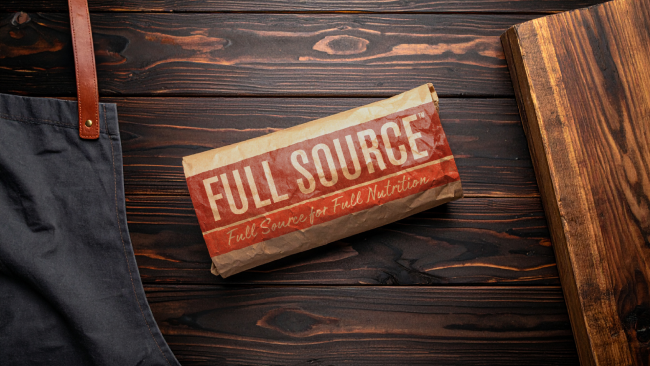
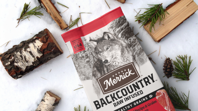
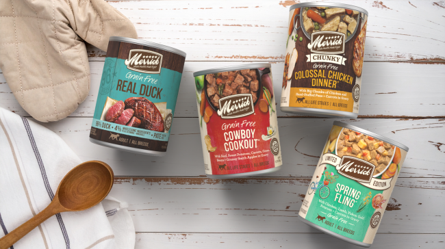
MERRICK | PACKAGING REVOLUTION
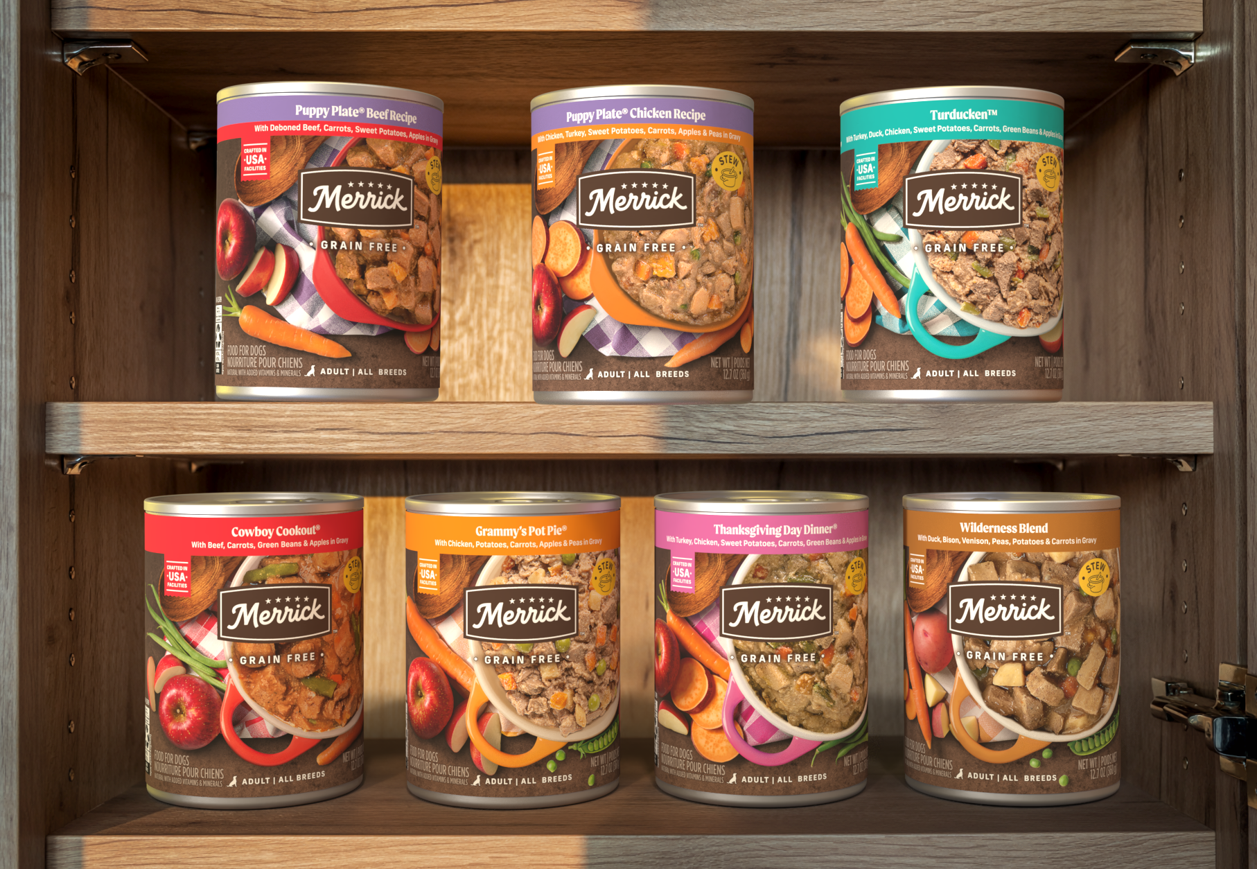
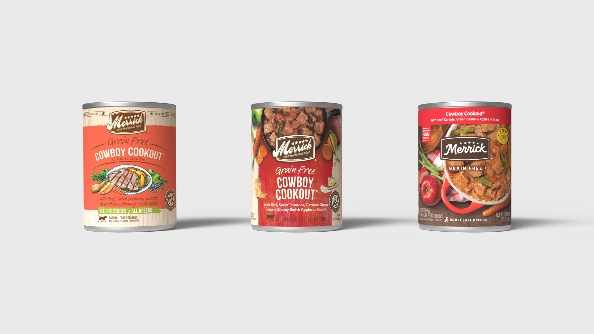
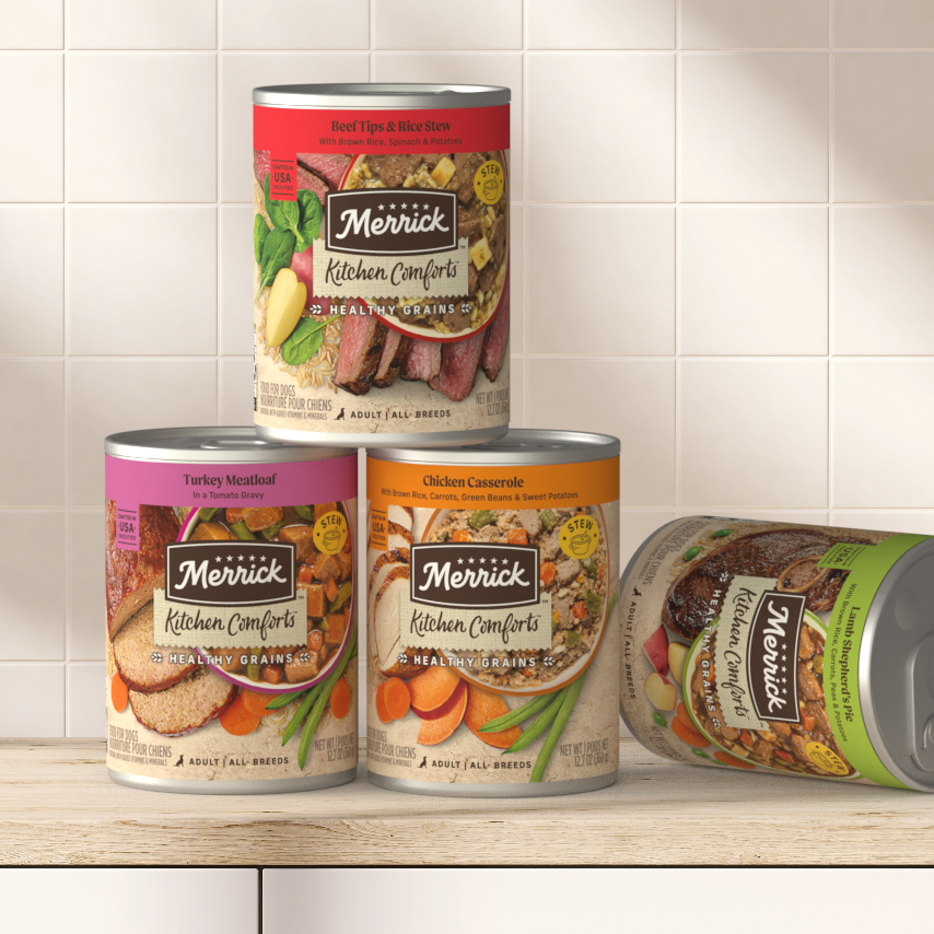
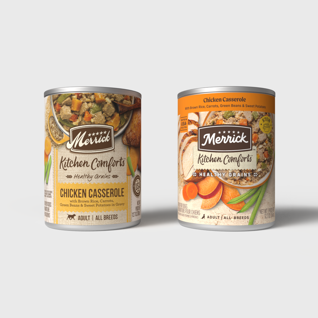
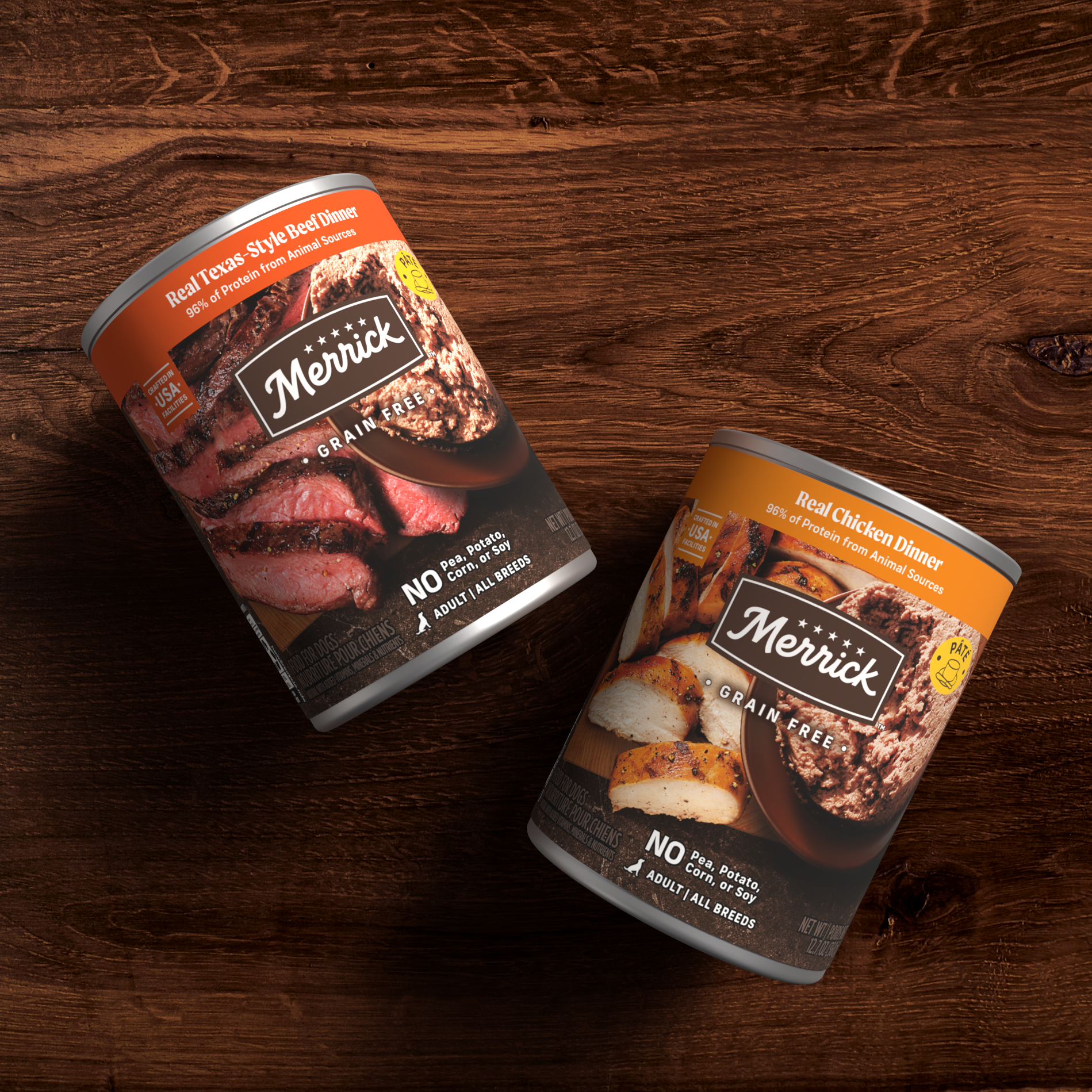
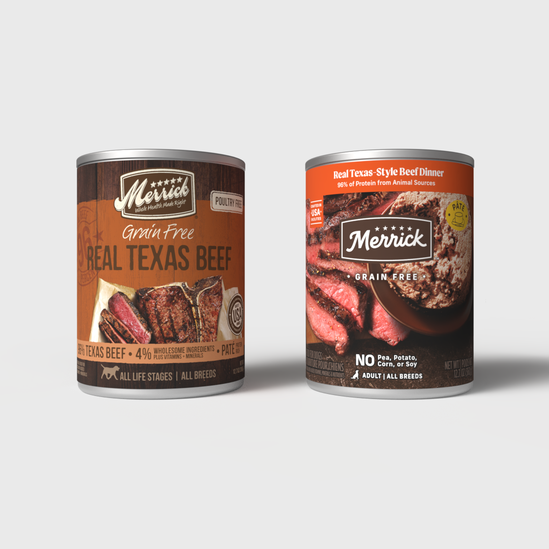
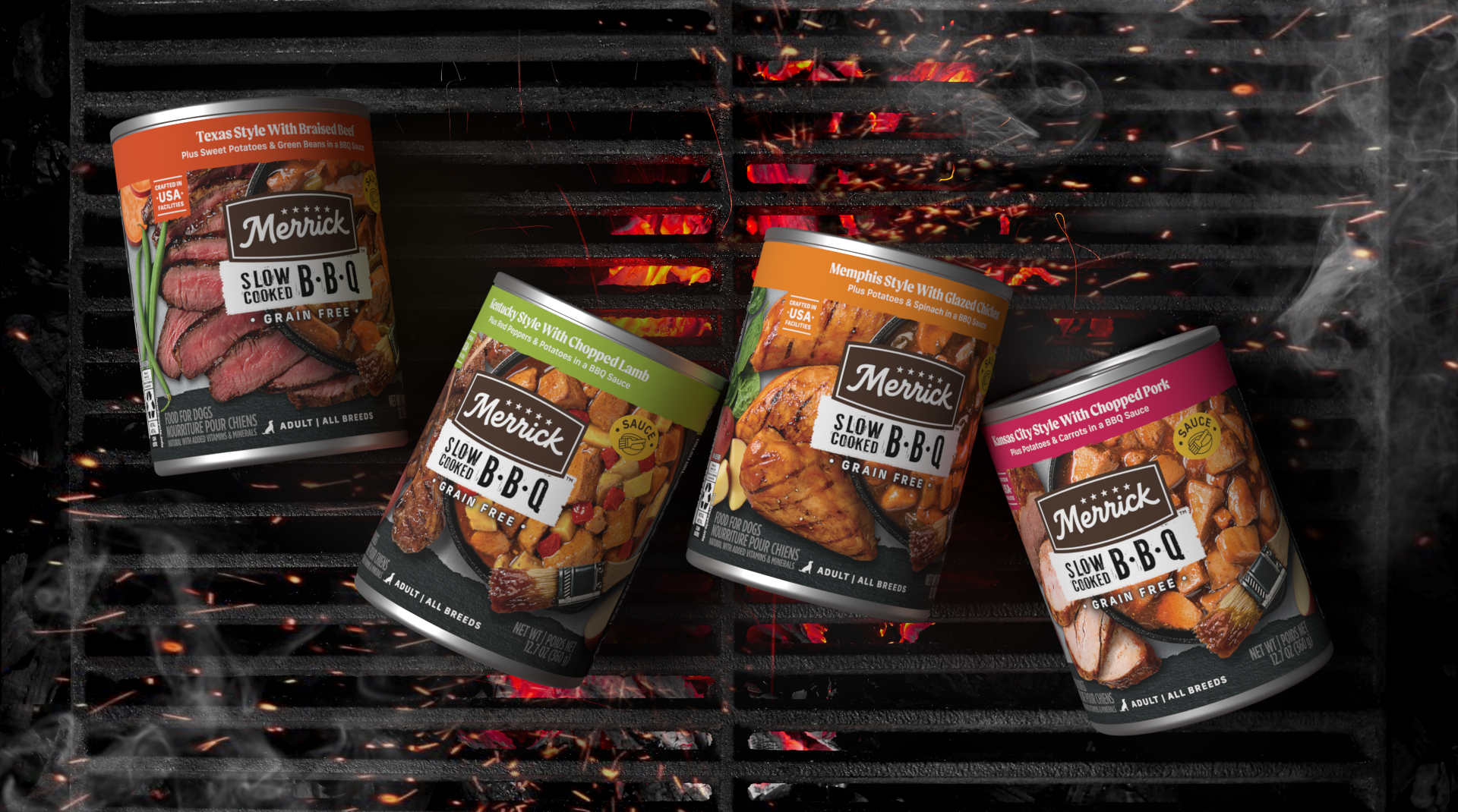
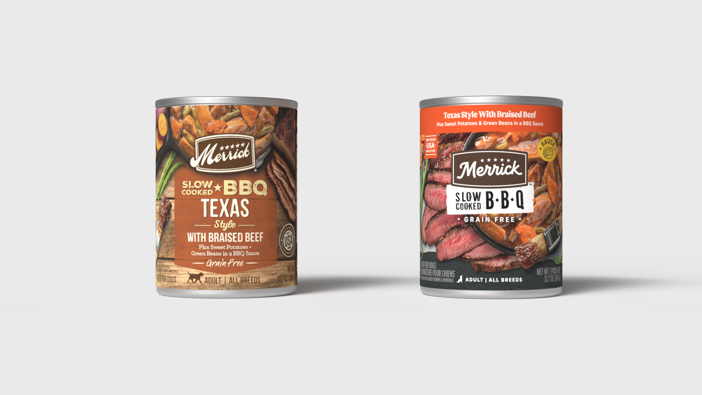
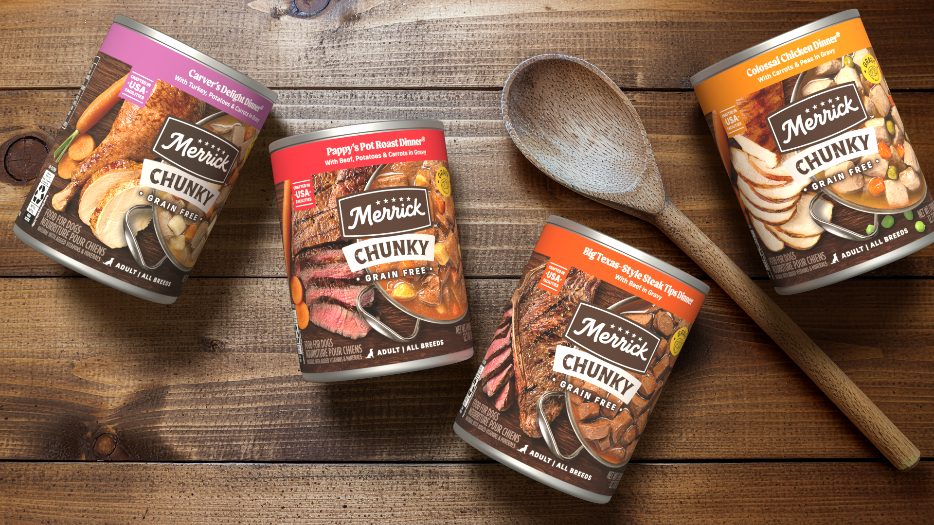
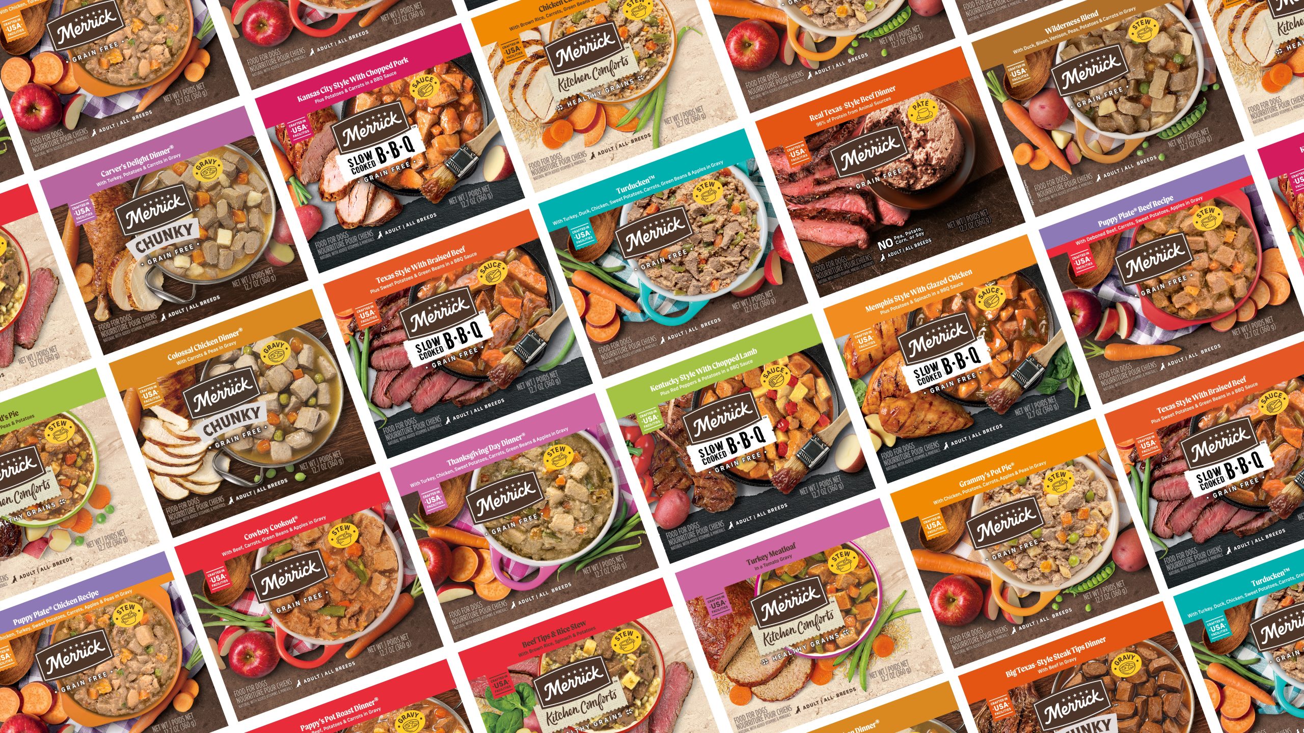
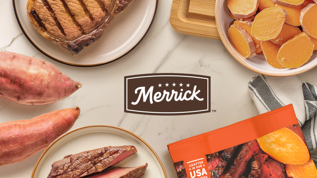
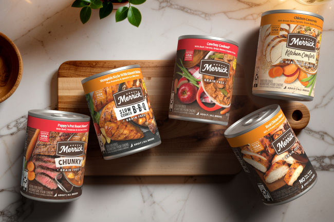
Strategic packaging redesign created to align the canned portfolio with Merrick’s updated “real ingredients” brand story. The visual system shifts the focus heavily toward bold, close-up food photography, allowing the ingredients to take center stage and reinforcing the authenticity of the product in a more immediate, impactful way.
KEY CONTRIBUTION:
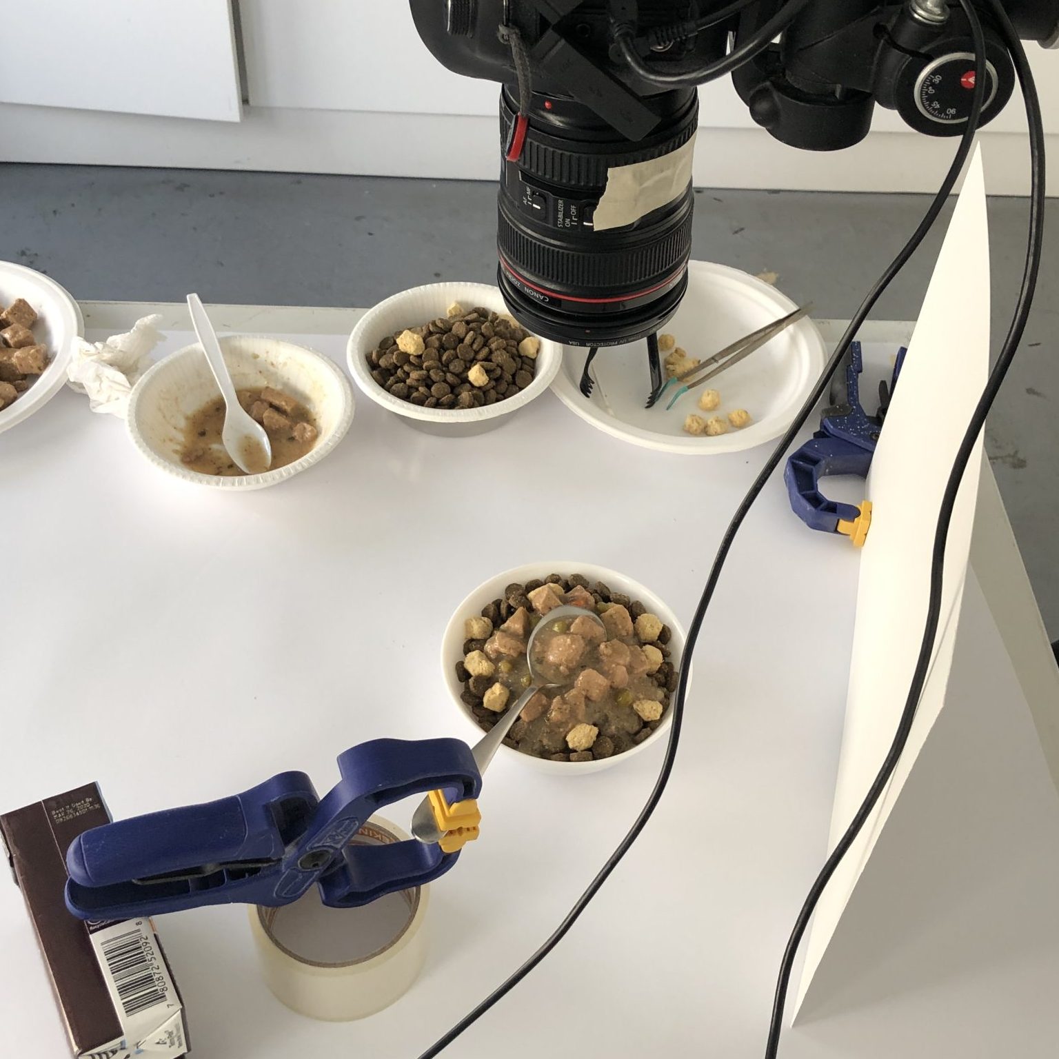
Design Concept · Packaging System Design · Packaging Extension · Photography Art Direction · Photo Retouching · Packaging Visualization
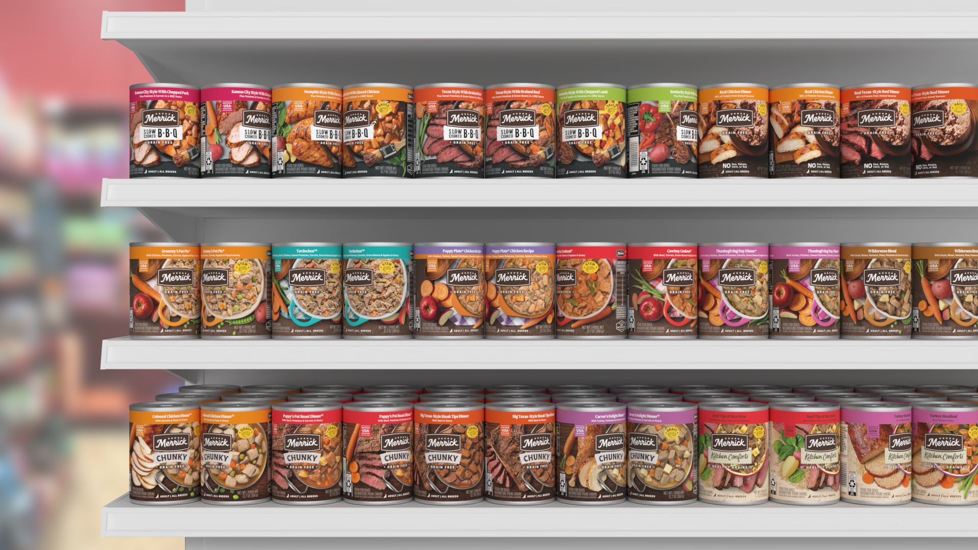
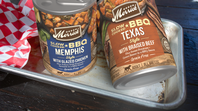
A key insight driving the design was understanding real shelf behavior: cans rarely stay perfectly front-facing. Instead of designing strictly within the narrow principal display panel, the imagery was expanded beyond the traditional “safe zone,” maximizing more of the visual display area on the can. By intentionally utilizing side panel real estate that often goes underused, the design creates a more dynamic and immersive visual experience as products rotate naturally over time.
As a result, the packaging delivers stronger shelf presence from multiple angles, maintaining appetite appeal even when shifted or partially turned. The expansive imagery not only increases visual impact but also reinforces the “real ingredients” narrative in a bold, unmistakable way.