Boldly Real
MERRICK | BRAND + PORTFOLIO REVOLUTION
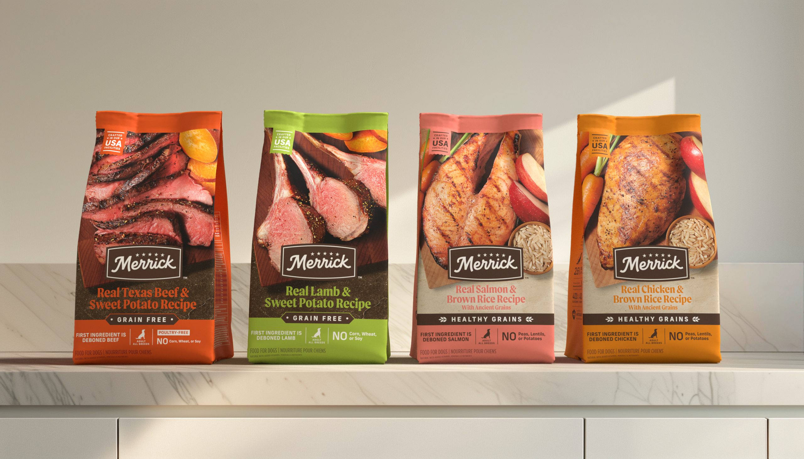
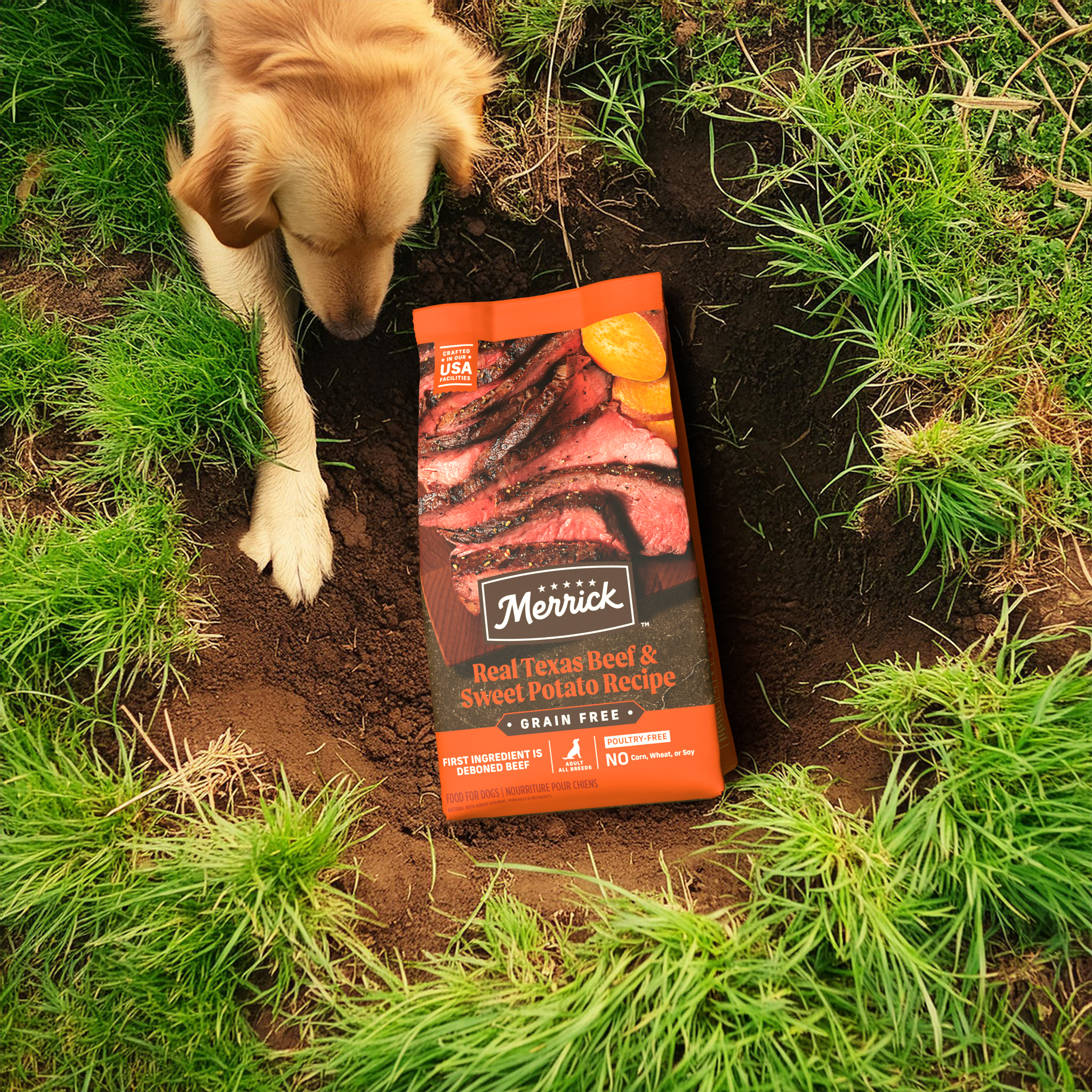
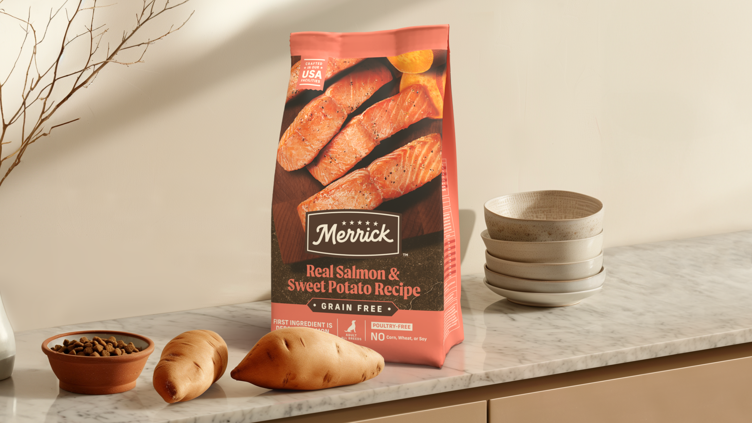
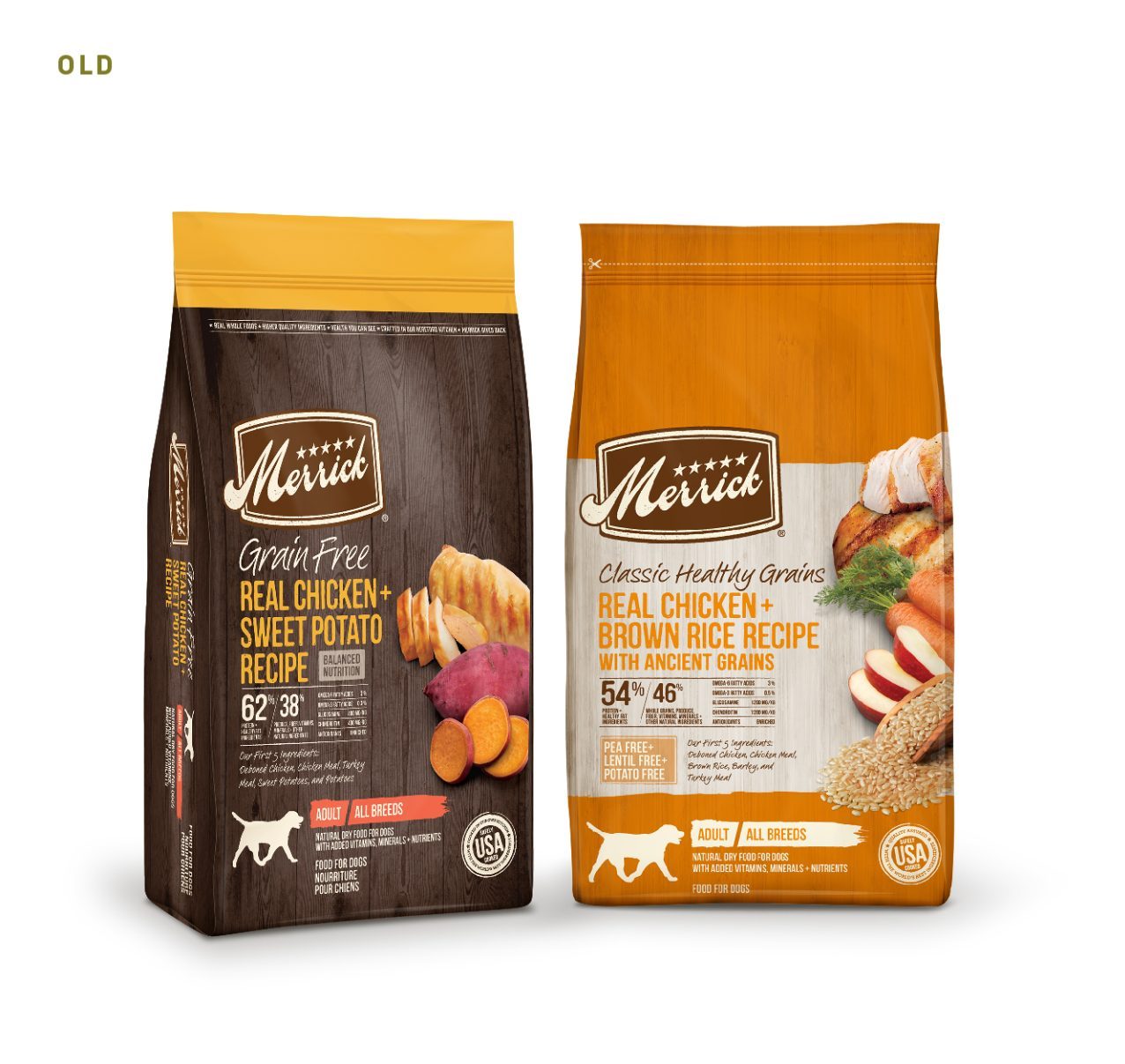
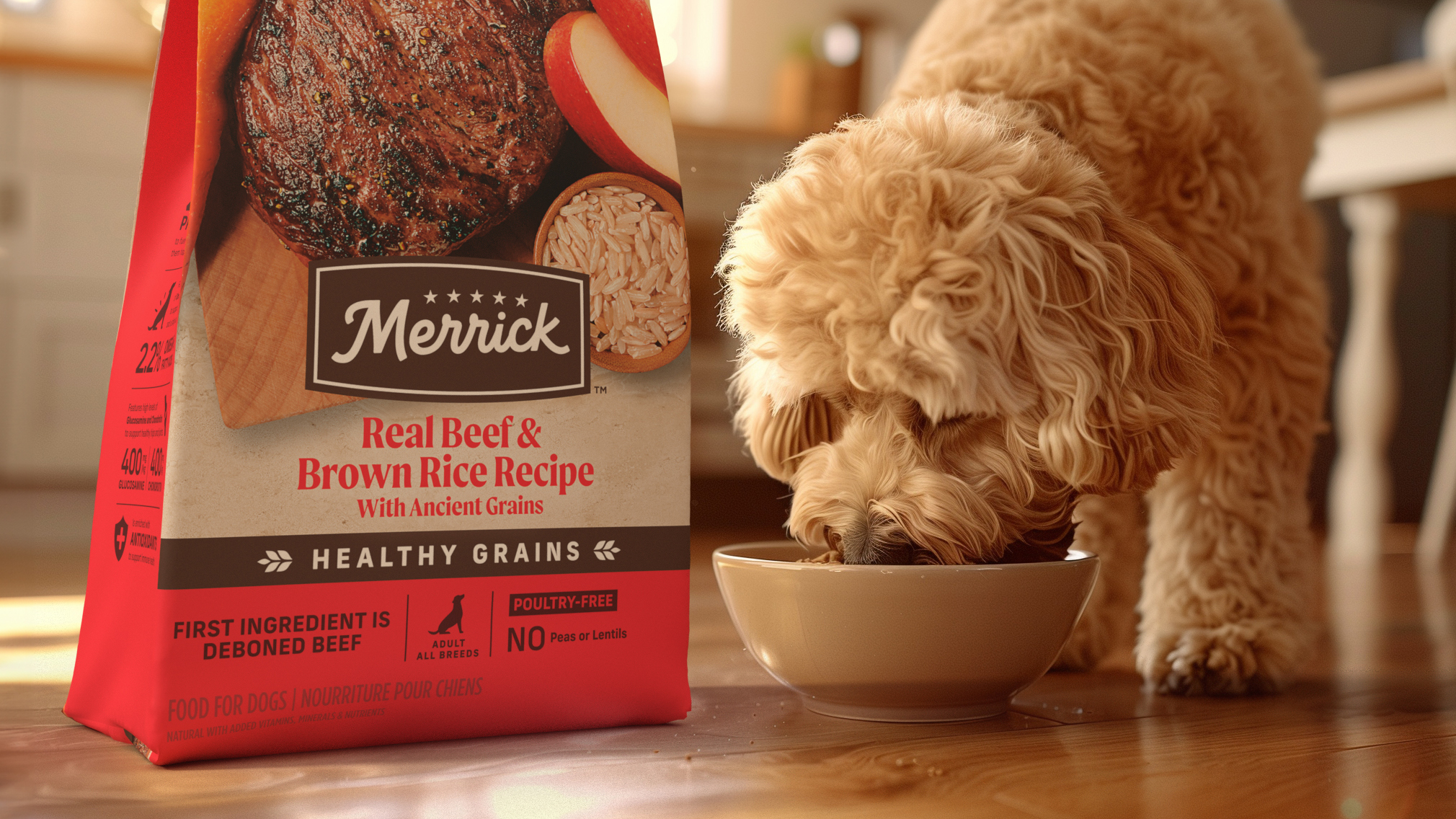
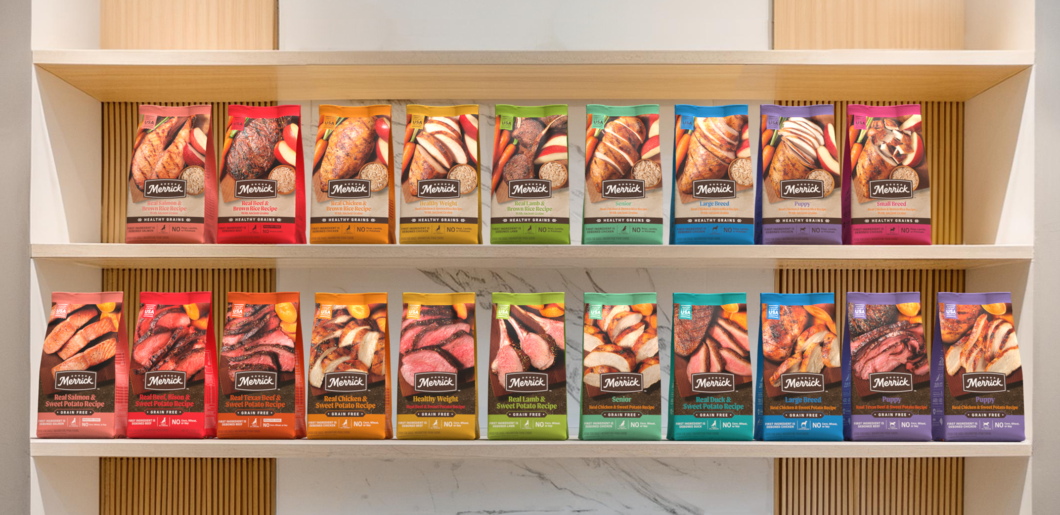
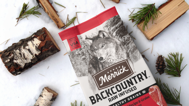
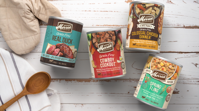
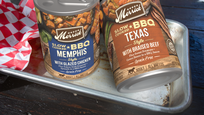
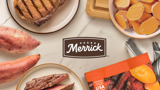
A bold packaging refresh for Merrick Pet Care rooted in the brand’s core belief that real ingredients are the foundation of better nutrition. The redesign modernizes the brand while preserving its strongest heritage equities, elevating real ingredients and nutritional credibility through impactful, appetite-forward food imagery and a streamlined system built to stand out in a crowded pet category. The result creates an immediate emotional connection while reinforcing quality, transparency, and trust for today’s pet parent.
KEY CONTRIBUTION:
Brand Identity Refresh · Design Concept · Packaging System Design · Packaging Extension · Photography Art Direction · Photo Retouching · Packaging Visualization
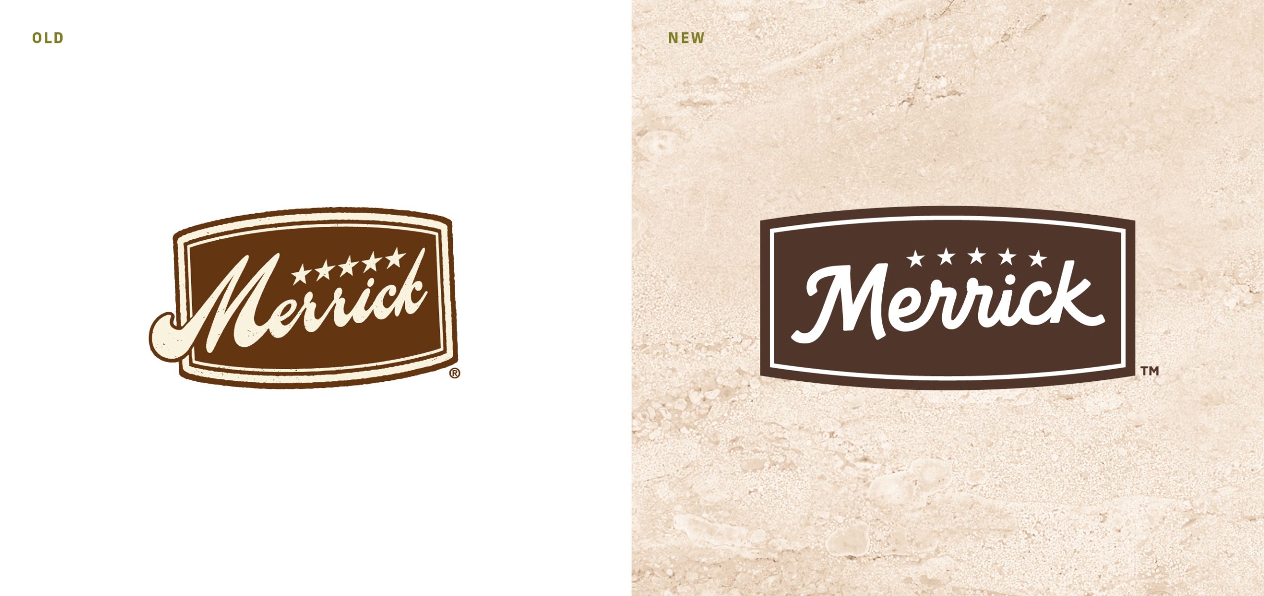
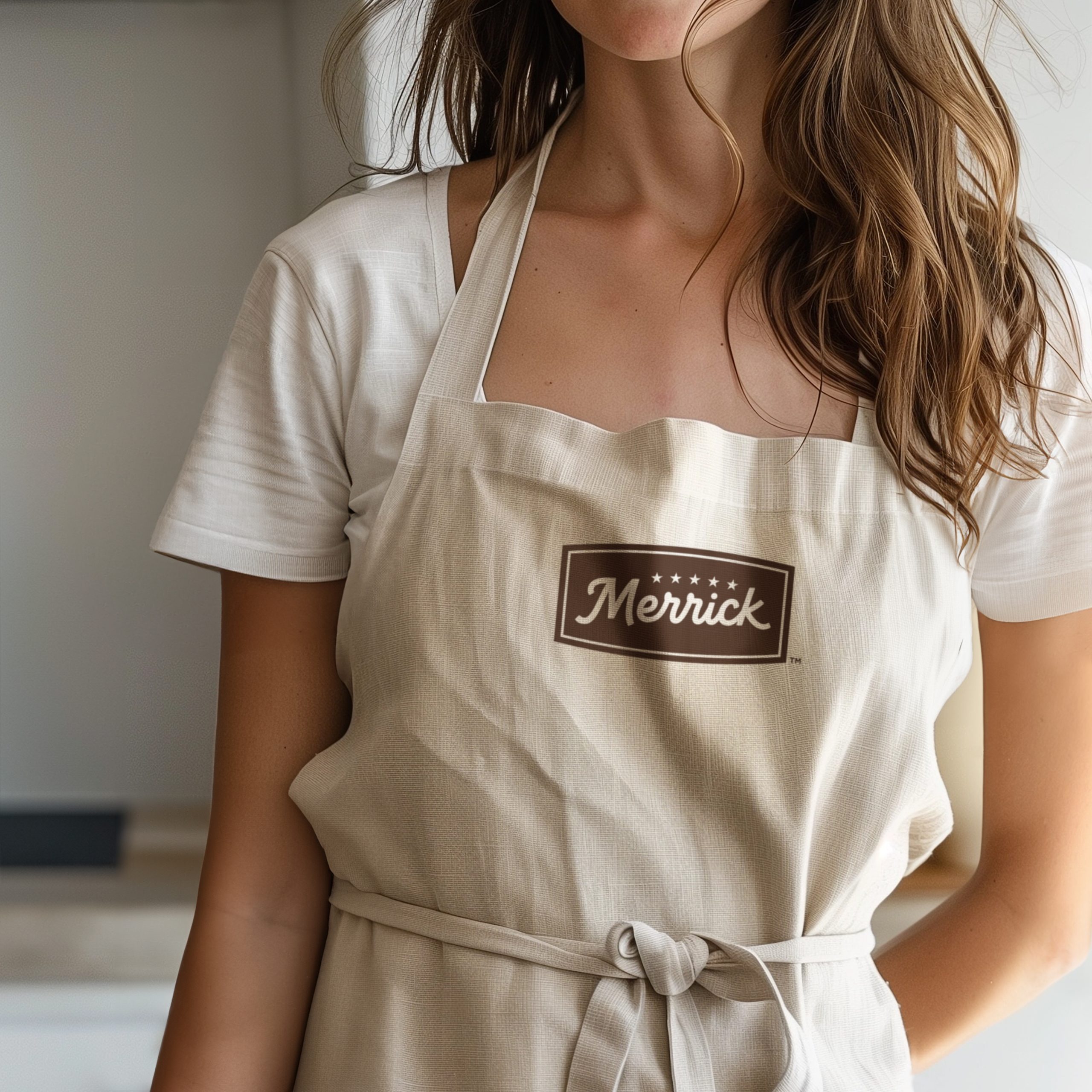
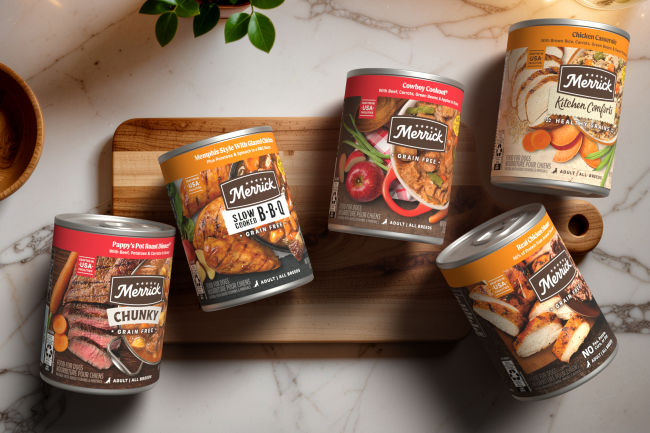
As the portfolio expanded across numerous sub-lines and SKUs, Merrick’s packaging needed simplification to improve shopability while maintaining the trust it had built over decades. The strategy balanced heritage and evolution — retaining the iconic script logo and signature Merrick brown while refining typography, hierarchy, and structural consistency. Consumer insights and testing informed a clearer wayfinding system that strengthened brand storytelling and improved navigation at shelf.
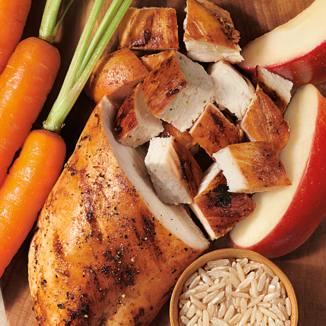
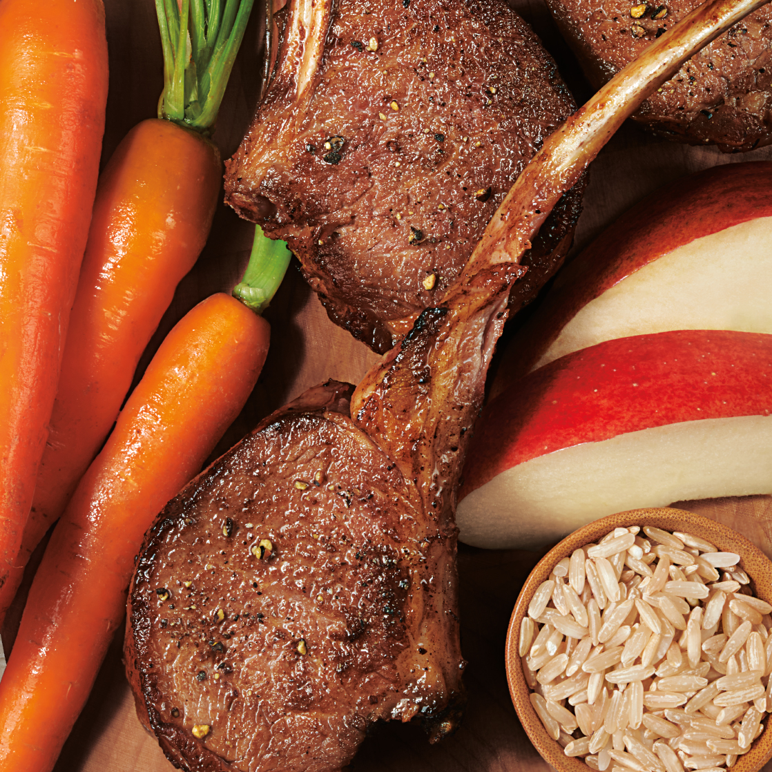
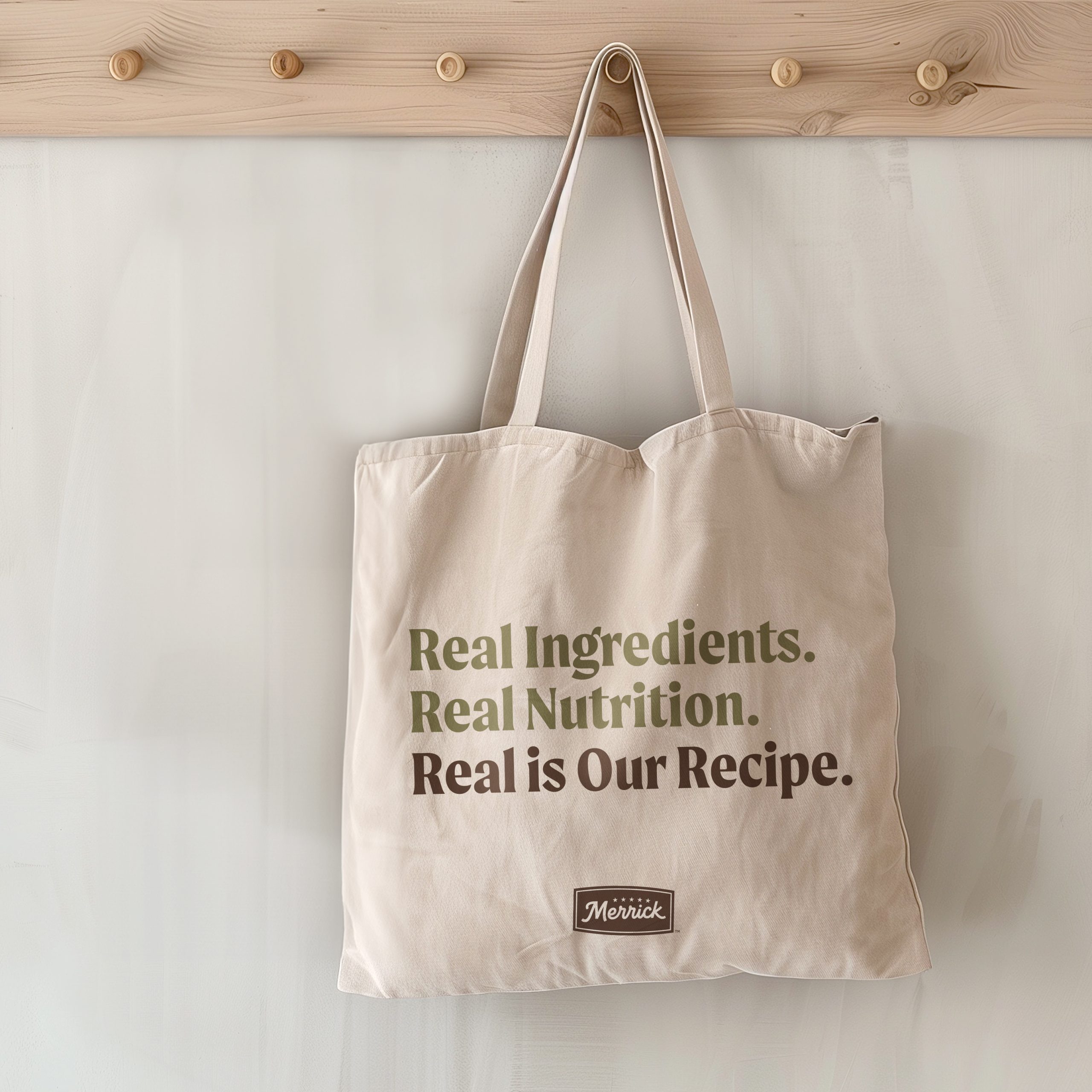
The refreshed design amplifies Merrick’s core promise of real nutrition and appetite appeal through elevated food photography that showcases natural, recognizable ingredients. A disciplined visual architecture creates cohesion across the portfolio while allowing each recipe to differentiate. The result is packaging that captures attention quickly, communicates clearly, and emotionally resonates — reinforcing Merrick as the brand pet parents trust and the food dogs crave.