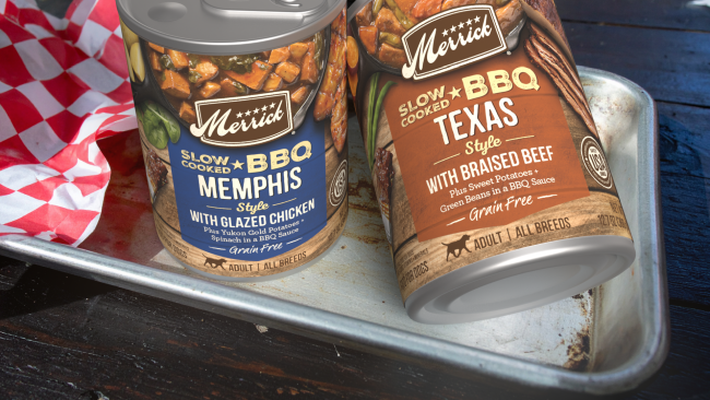
Bark-B-Que
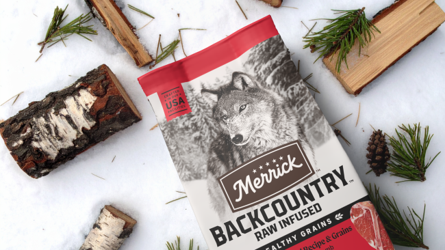
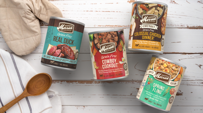
MERRICK | PACKAGING DESIGN
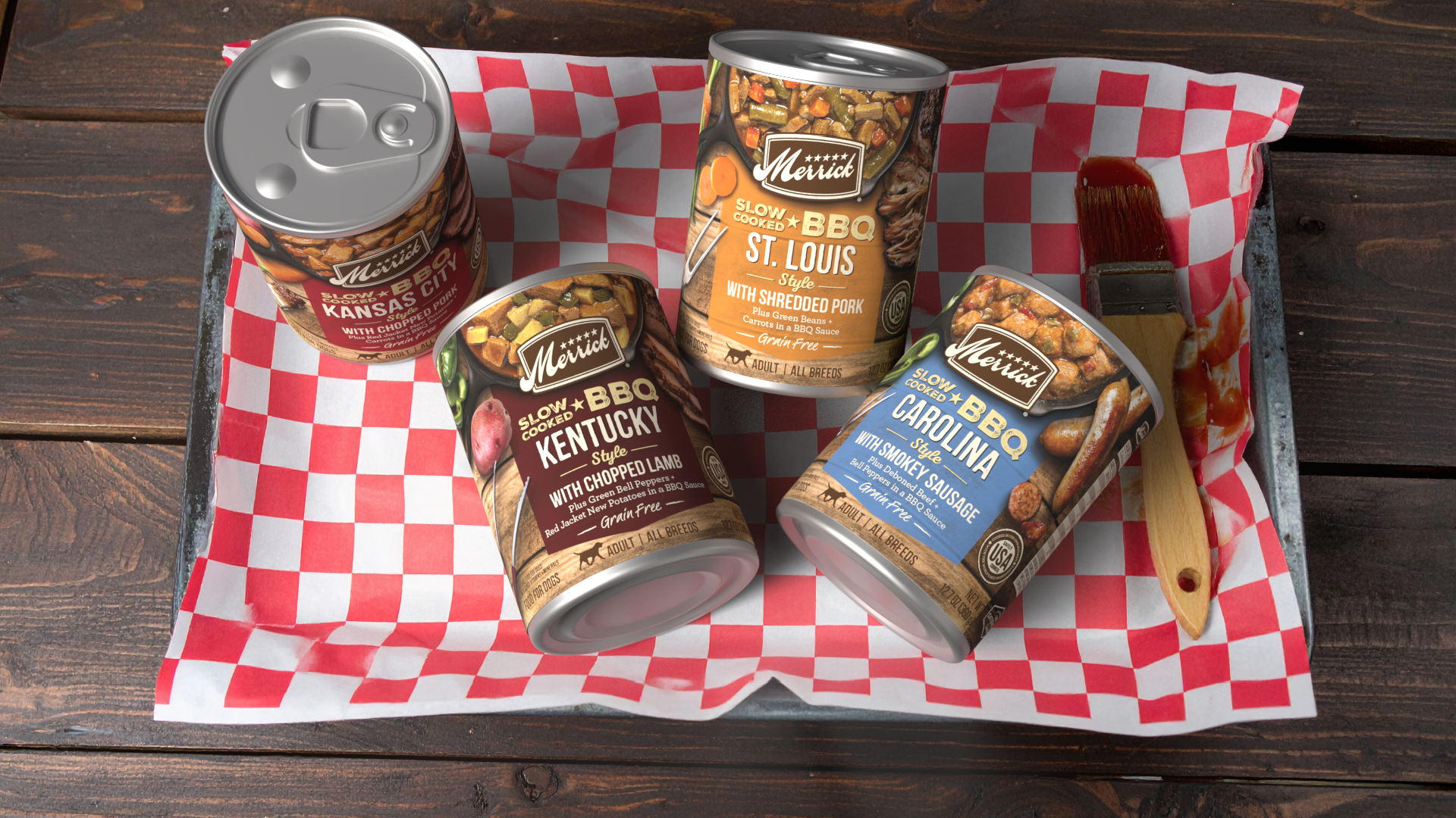
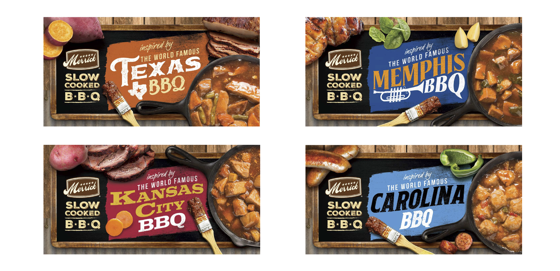
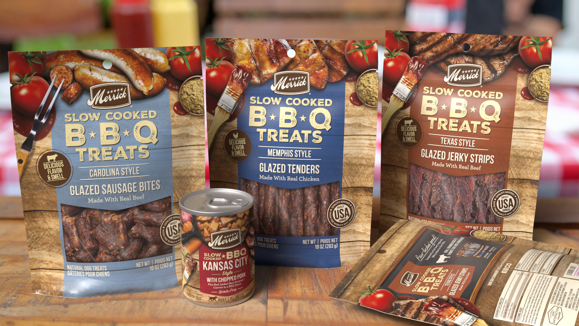
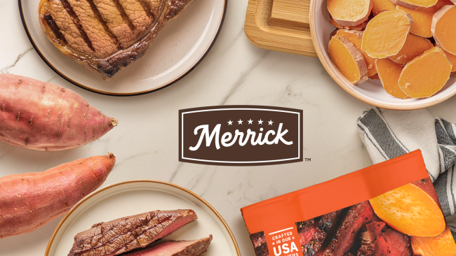
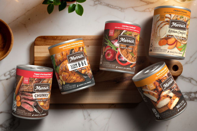
Introducing a new sub-line within Merrick’s wet food portfolio inspired by the bold, comforting character of regional American BBQ. Layered textures, rich color blocking, and smokehouse-inspired details bring the concept to life, creating packaging that feels warm, flavorful, and full of personality. The sub-line tells its own story while contributing to a larger, cohesive visual world.
KEY CONTRIBUTION:
Design Concept · Packaging Extension · Food Photography · Food Styling · Photo Retouching · Imagery Composition · Packaging Visualization
Although visually distinct, the design was thoughtfully developed to differentiate from the core line without losing brand recognition. A clear and consistent hierarchy keeps the sub-line connected to the broader portfolio, while regional cues and intentional color segmentation give each recipe its own presence. Together, the lineup creates a strong, unified block that stands out on shelf.
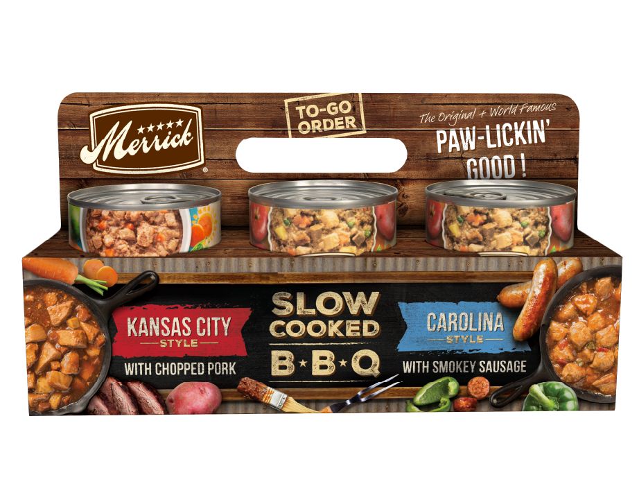
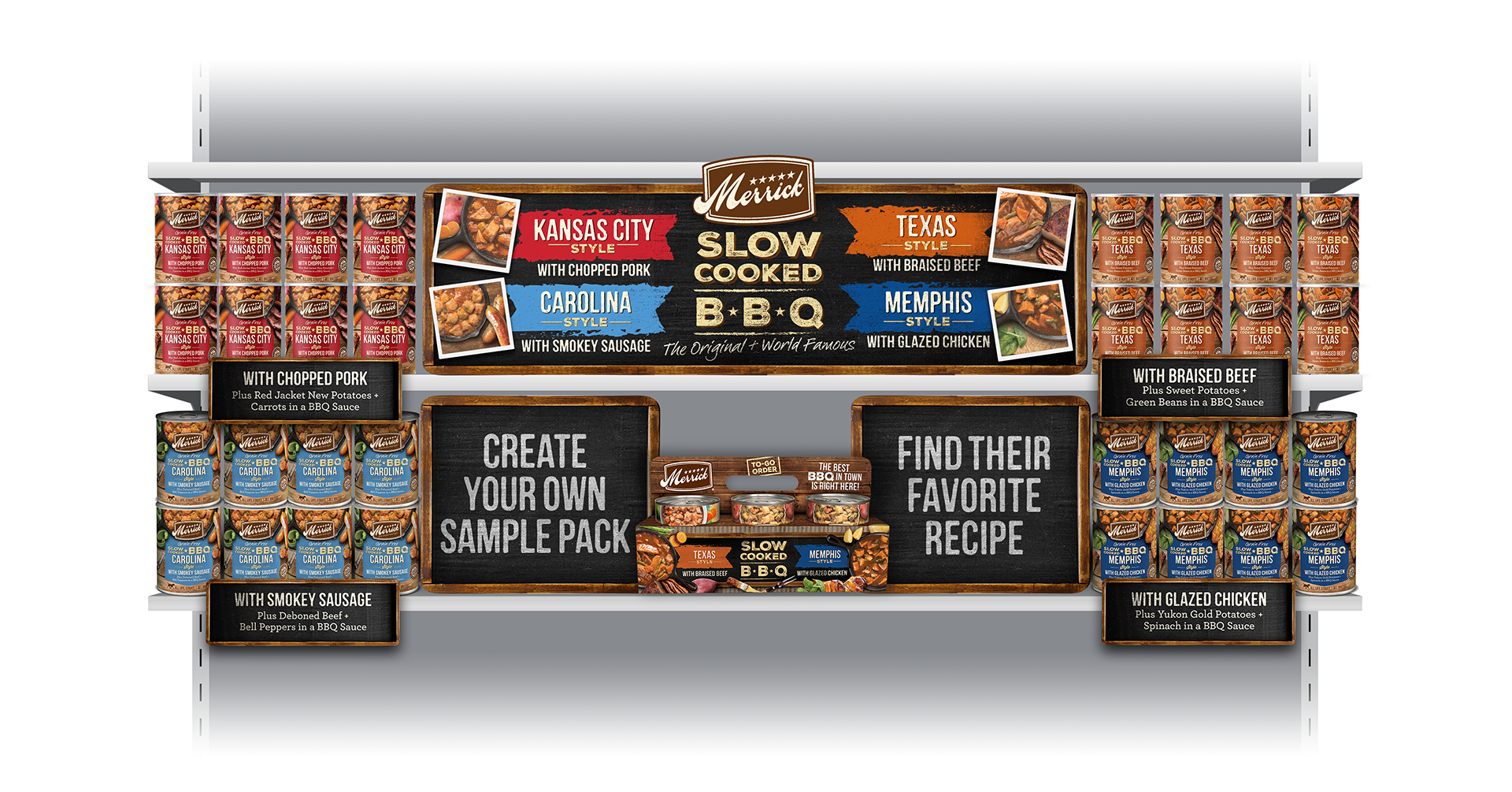
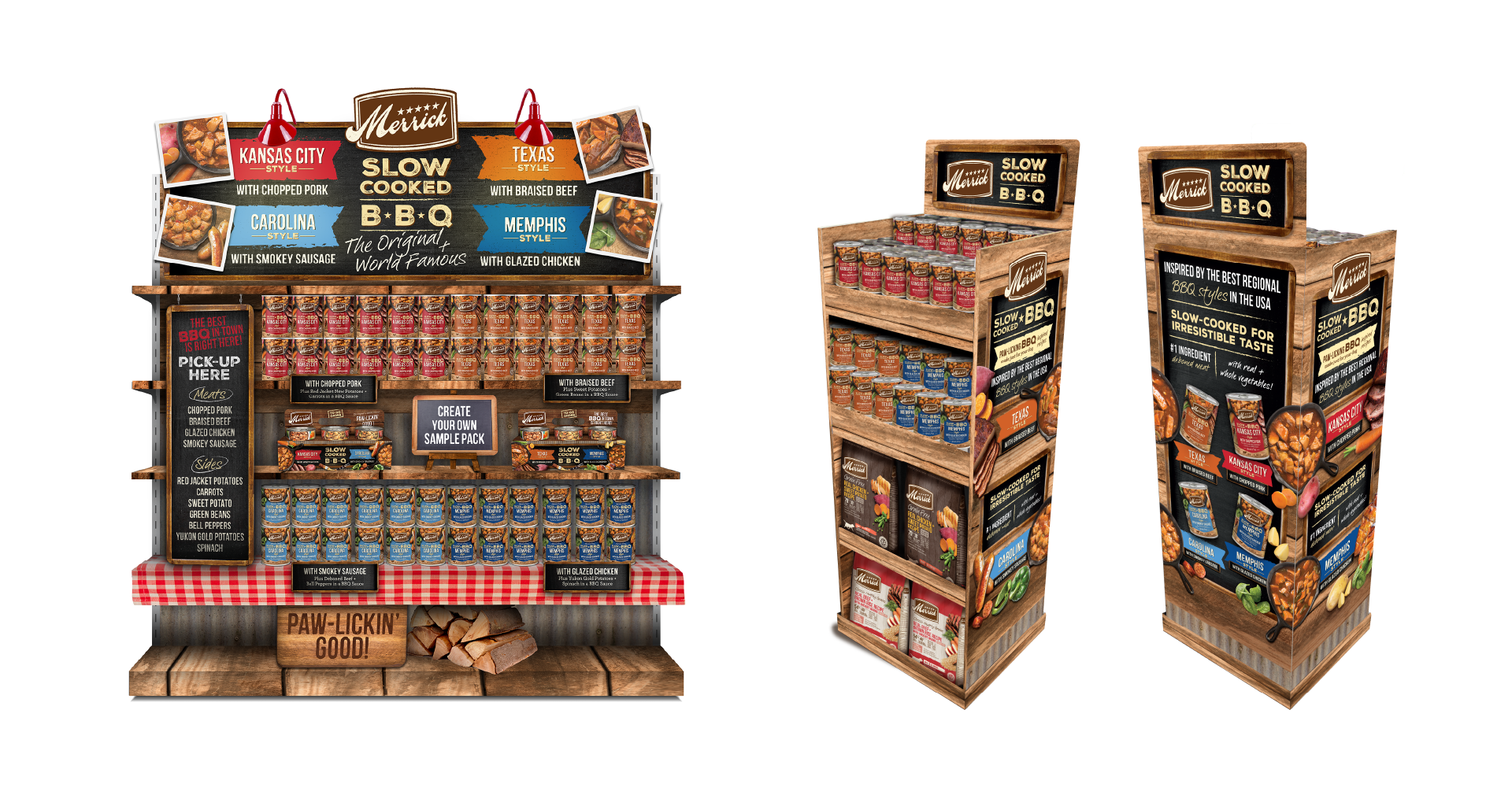
The visual language carries through to treat bags, a branded 6-pack carrier, and in-store elements such as shelf sets and endcaps. Every touchpoint reinforces the same smokehouse narrative, helping create a cohesive launch experience that feels considered, immersive, and engaging for the consumer.