Purely Grown
SAFEWAY | O ORGANICS REFRESH
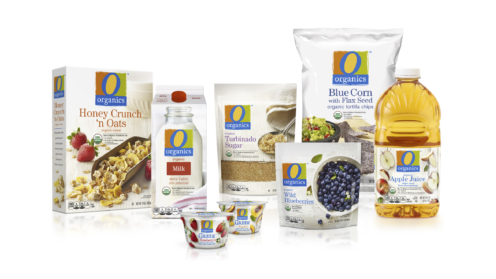
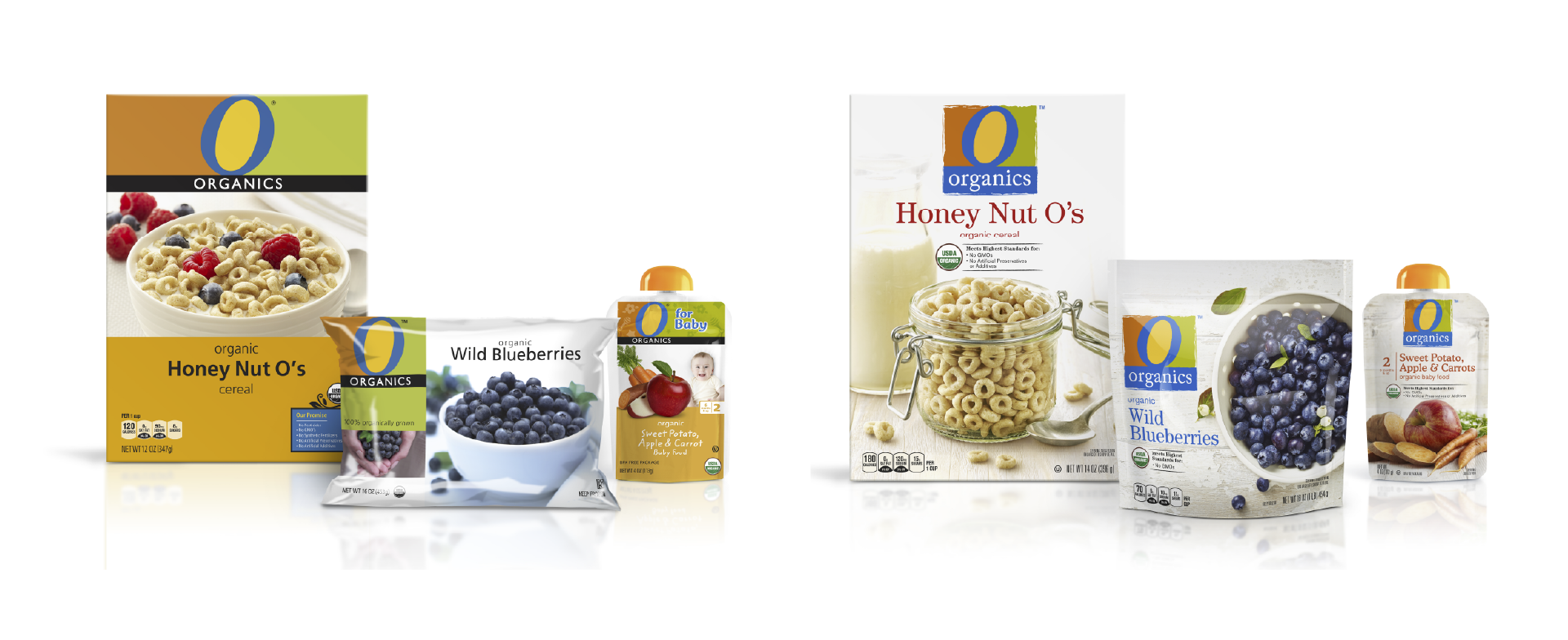
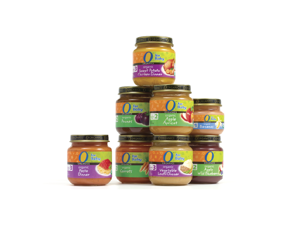
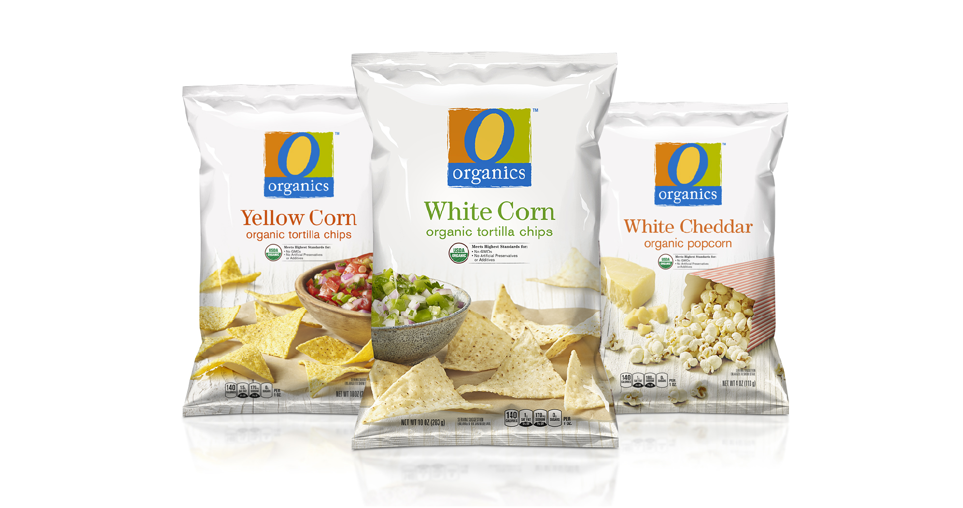
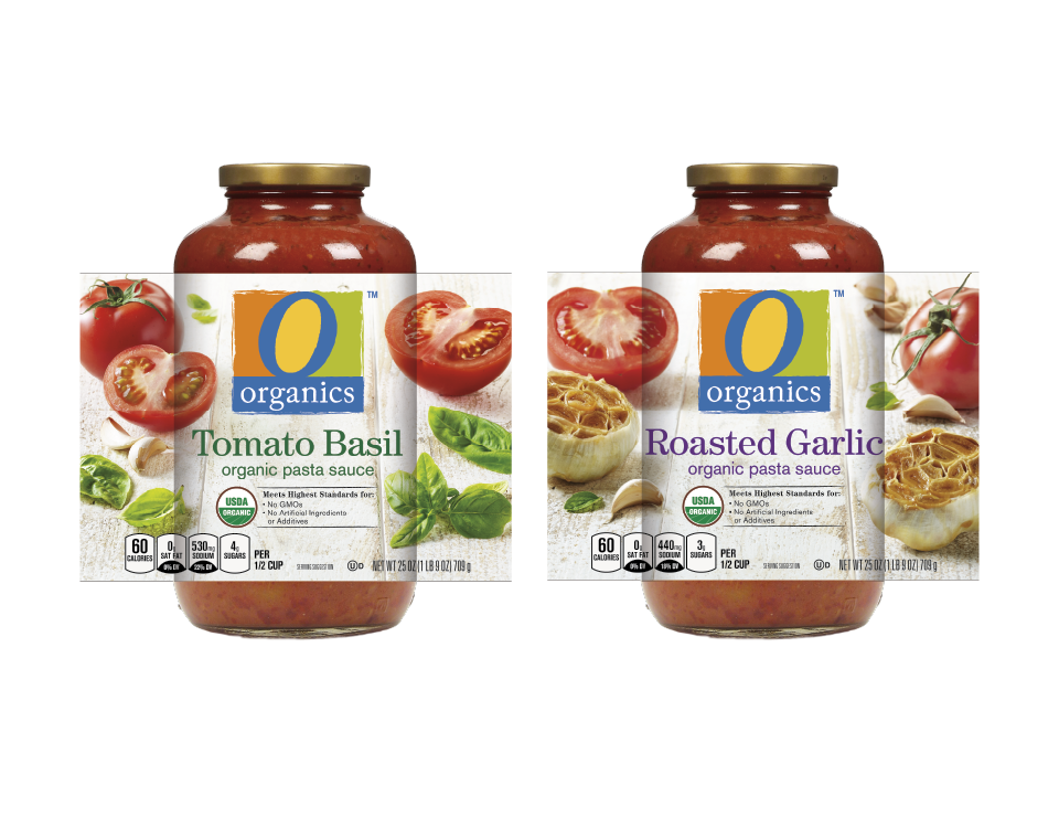
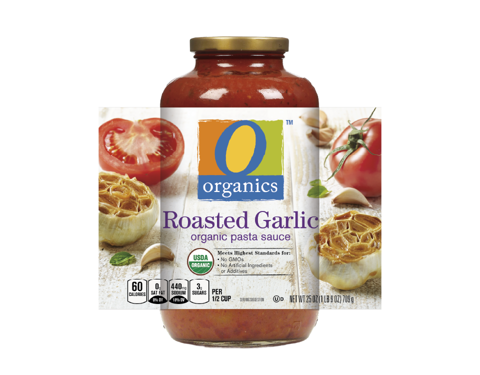
A brand world built around the idea of Purely Grown — a guiding platform that shapes every visual and verbal expression. Rooted in the belief that purity begins at the source, the brand connects the integrity of where food is grown with the personal intention behind what we choose to put into our bodies. Photography plays a key role in delivering this idea, visually expressing the meaning behind the name Purely Grown through honest, just-picked ingredients and fresh-from-the-farm preparation that bring the product story to life.
KEY CONTRIBUTION:
Brand Identity Refresh · Design Concept · Packaging System Design · Packaging Extension · Photography Art Direction
Purely Grown serves as both a creative driver and a strategic foundation, resonating at two levels: the pure source of the food itself and the purity of the consumer’s personal choices. The brand strikes a balance that is simple yet vibrant, friendly yet principled — creating a consistent and authentic point of view across all touchpoints.
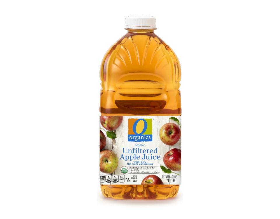
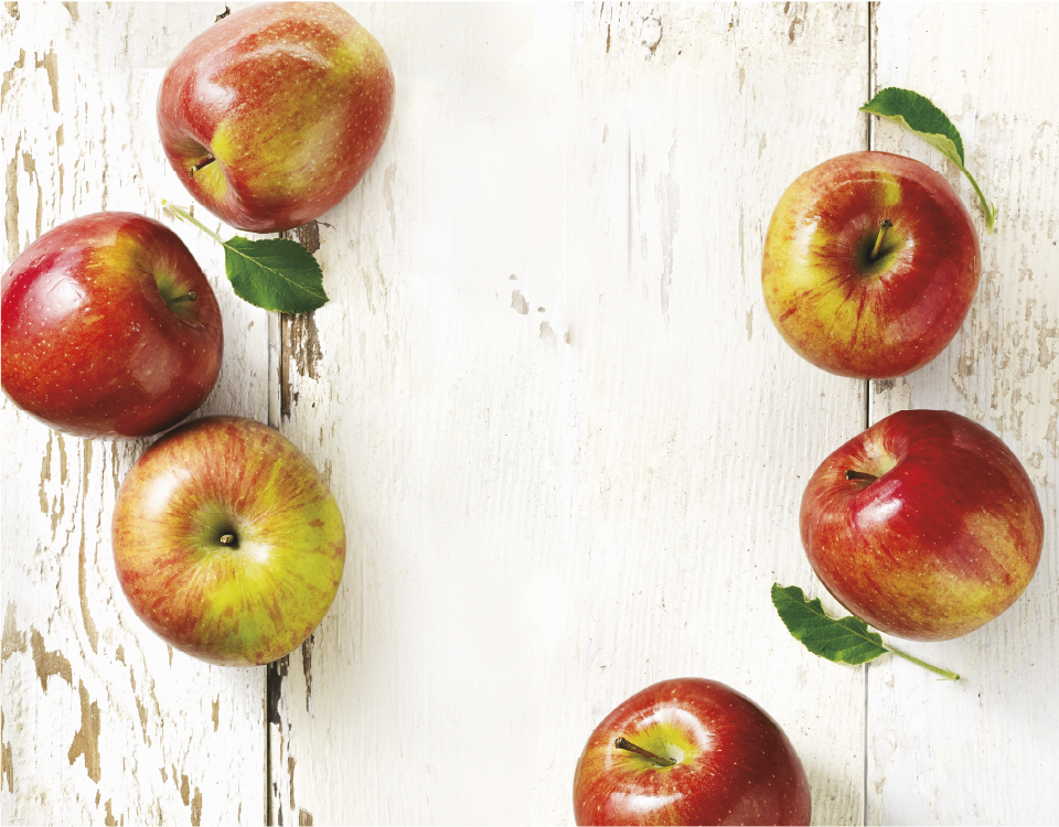
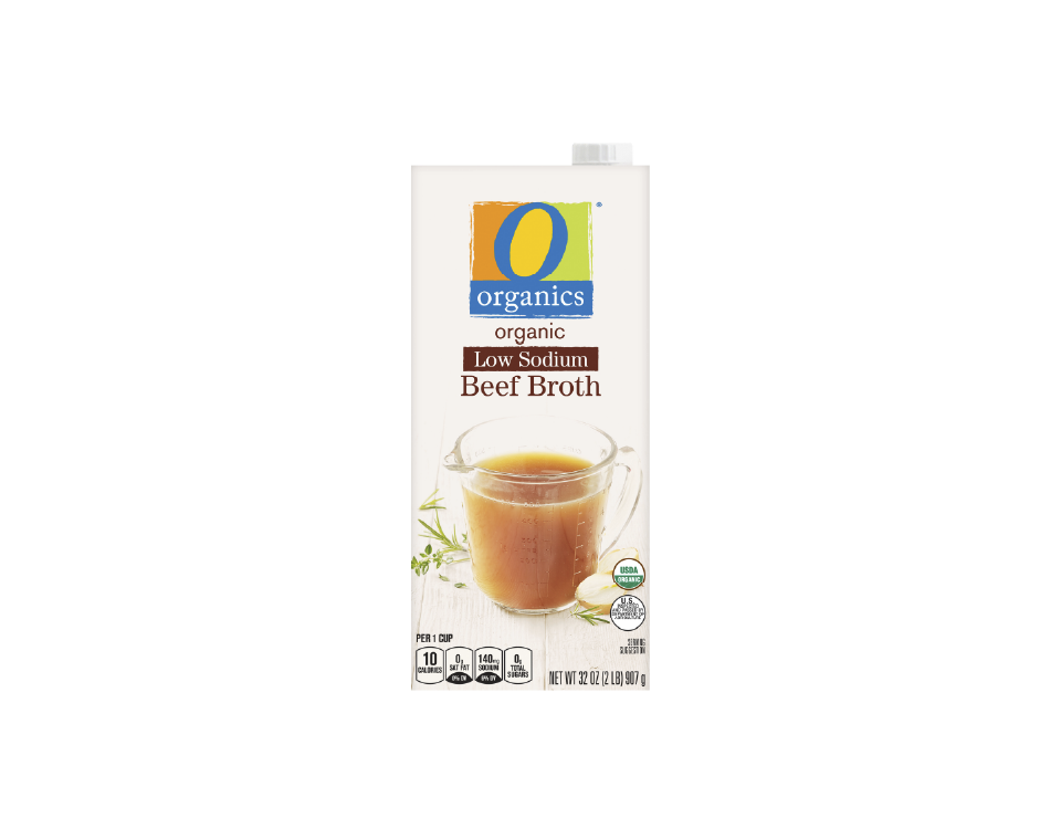
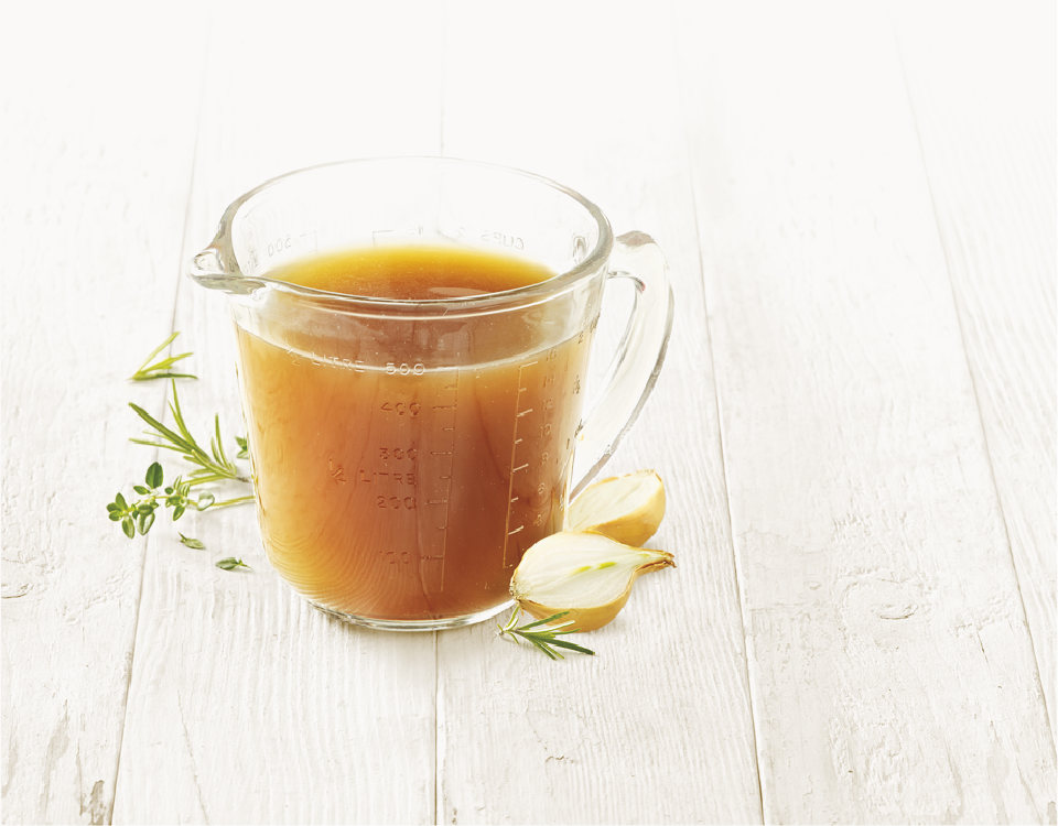
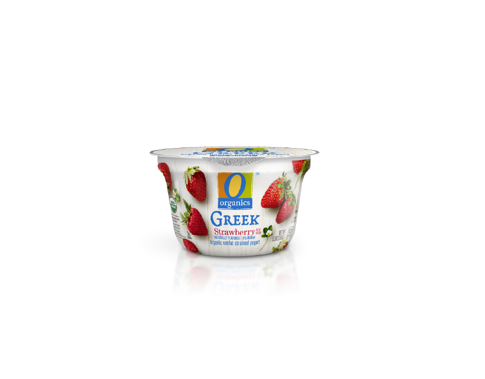
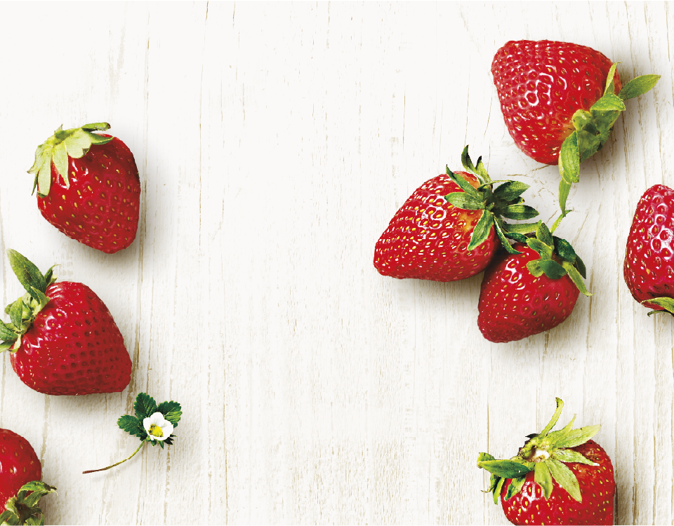
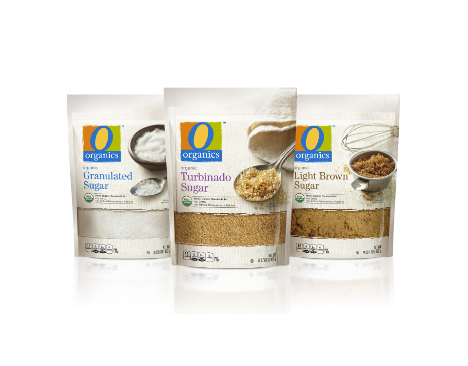
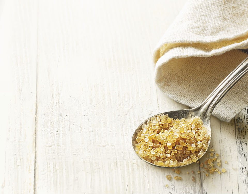
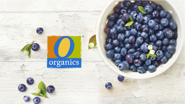
Visually, the brand story comes to life through the farmhouse setting — a warm, grounded world that communicates freshness, proximity to the source, and a deep respect for ingredients. The casual, slightly rustic aesthetic reinforces the idea that the food is real, approachable, and thoughtfully grown.
Product photography plays a central role in expressing the brand’s point of view. Ingredients are celebrated in their purest, just-picked form — stems, leaves, and blossoms intact — or shown freshly prepared within the farmhouse environment. This approach highlights both the integrity of the source and the care taken in bringing the food to the table, creating an emotional connection rooted in simplicity and trust.